Table of Contents
- 1 What is the use of "label" in SAS or STATA?
- 2 Comment on Univariate Statistic Tables
- 3 Comment on the Histograms of Total Debt/Assets for Default vs Healthy
- 4 What are the results of normality tests for Total Debt/Assets for Default and Healthy?
- 5 Test equivilance of means using students test in 4 frameworks
- 6 Box Plots for Each Independent Variable
- 7 Bivariate Correlation with the Dependent Variable
- 8 Bivariate Correlation Between Regressors
- 9 Scatter Plots for Selected Variables
- 10 Univariate Linear Probability Model
- 11 Residuals of the Linear Probability Model
- 12 Univariate Logit Model
- 13 Compare the Estimates of Probit and Logit for the Univariate Model
- 14 How can the percentage of concordant pairs be obtained?
- 15 ROC-AUC Curves for Univariate Models
- 16 Multivariate Logit Regression
- 17 Studentized Residuals for the Step-Out Model
- 18 Relative Weight of Type 1 and Type 2 Errors for a Private Banker
- 19 In- and Out-of-Sample Metrics for the Step-Out Model
- 20 What Weight Would I Give This Model as a Credit Analyst
- 21 Additional Work
- 22 Putting it All Together
- 23 Concluding Remarks
import warnings
warnings.simplefilter("ignore", category=FutureWarning)
import pandas as pd
import numpy as np
import matplotlib.pyplot as plt
from matplotlib.offsetbox import AnchoredText
from matplotlib.colors import ListedColormap, rgb2hex
import matplotlib.patches as mpatches
import seaborn as sns
from scipy import stats
import jesse_tools
from sklearn.metrics import recall_score, accuracy_score, precision_score, fbeta_score, f1_score
from eli5.sklearn import PermutationImportance


%matplotlib inline
def optimize_threshold(X, y, model, metric='accuracy', β=None):
    best_threshold = 0
    best_score = 0
    for threshold in np.linspace(0, 1, 100):
        pred = np.array([1 if x > threshold else 0 for x in model.predict(X)])

        if metric == 'accuracy':
            score = accuracy_score(y, pred)
        elif metric == 'recall':
            score = recall_score(y, pred)
        elif metric == 'precision':
            score = precision_score(y, pred)
        elif metric == 'f' and not β:
            raise ValueError('β must be specified with metric f')
        elif metric == 'f' and β:
            score = fbeta_score(y, pred, β)

        if score > best_score:
            best_score = score
            best_threshold = threshold
    return best_threshold, best_score, np.array([1 if x > best_threshold else 0 for x in model.predict(X)])

def plot_class_regions_for_classifier(clf, X, y, X_test=None, y_test=None, title=None, xlabel=None, ylabel=None,
                                      mode = None, target_names = None, threshold=None, ax = None, xgboost=False):

    numClasses = np.amax(y) + 1
    color_list = [rgb2hex(x) for x in cm.Set1_r.colors]
    color_list = [color_list[0]] + [color_list[8]]

    h = 0.01
    k = 0.5
    x_plot_adjust = 0.1
    y_plot_adjust = 0.1
    plot_symbol_size = 50

    if isinstance(X, pd.DataFrame):
        xlabel = X.columns[0]
        ylabel = X.columns[1]
    else:
        xlabel = xlabel
        ylabel = ylabel

    if isinstance(X, pd.DataFrame):
        X = X.values
    if isinstance(X_test, pd.DataFrame):
        X_test = X_test.values

    x_min = X[:, 0].min()
    x_max = X[:, 0].max()
    y_min = X[:, 1].min()
    y_max = X[:, 1].max()

    x2, y2 = np.meshgrid(np.arange(x_min-k, x_max+k, h), np.arange(y_min-k, y_max+k, h))

    if mode == 'predict_proba':
        P = clf.predict_proba(np.c_[x2.ravel(), y2.ravel()])[:, 1]
        P = P.reshape(x2.shape)
    else:
        P = clf.predict(np.c_[x2.ravel(), y2.ravel()])
        P = P.reshape(x2.shape)

    if threshold:
        s, _, _ = optimize_threshold(X, y, clf, metric='accuracy')
        P = np.vectorize(lambda x: 1 if x > s else 0)(P)

    if ax is None:
        fig, ax = plt.subplots(figsize=(8,6), dpi=100)

    cmap_colors = ListedColormap(color_list)

    cset = ax.contourf(x2, y2, P, levels=np.arange(P.max() + 2) - 0.5,
                    cmap=ListedColormap(color_list), alpha = 0.6)

    ax.contour(x2, y2, P, levels=cset.levels, colors='k', linewidths=0.5, antialiased=True)

    train_scatter = ax.scatter(X[:, 0], X[:, 1], c=y, cmap=cm.Set1_r, s=plot_symbol_size,
                               edgecolor = 'black', label='Training Data')
    ax.set_xlim(x_min - x_plot_adjust, x_max + x_plot_adjust)
    ax.set_ylim(y_min - y_plot_adjust, y_max + y_plot_adjust)

    ax.set_xlabel(xlabel)
    ax.set_ylabel(ylabel)

    if (X_test is not None):
        test_scatter = ax.scatter(X_test[:, 0], X_test[:, 1], c=y_test, cmap=cm.Set1_r,
                                  s=plot_symbol_size, marker='^', edgecolor = 'black', label='Test Data')
        if hasattr(clf, 'predict_proba'):
            train_score = roc_auc_score(y, clf.predict_proba(X)[:,1])
            test_score  = roc_auc_score(y_test, clf.predict_proba(X_test)[:,1])
        else:
            train_score = roc_auc_score(y, clf.predict(X))
            test_score  = roc_auc_score(y_test, clf.predict(X_test))
        title = title + f"\nIn-Sample AUC = {train_score:.2f}, Out-of-Sample AUC = {test_score:.2f}"

    if (target_names is not None):
        legend_handles = []
        for i in range(0, len(target_names)):
            patch = mpatches.Patch(color=color_list[i], label=target_names[i])
            legend_handles.append(patch)
        legend_handles.append(train_scatter)
        legend_handles.append(test_scatter)
        leg = ax.legend(loc=0, handles=legend_handles)
        leg.legendHandles[2].set_color('black')
        leg.legendHandles[3].set_color('black')


    if (title is not None):
        ax.set_title(title)
    jesse_tools.remove_chart_ink(ax)
    return ax


def find_outliers(y, y_hat, X=None, mode='binary'):
    if isinstance(X, pd.DataFrame):
        X = X.values
    resid = y - y_hat
    if mode == 'binary':
        student_resid = resid / np.sqrt(y_hat * (1 - y_hat))
    elif mode == 'linear':
        if X is None:
            raise ValueError('linear-mode studentization requires feature matrix X')
        else:
            H = X @ np.linalg.inv(X.T @ X) @ X.T
            sigma = np.sqrt((1 / (X.shape[0] - X.shape[1])) * np.sum(resid**2))
            student_resid = resid / (sigma * np.sqrt(1 - np.diag(H)))
    outliers = []
    for x, index in zip(student_resid, student_resid.index):
        if ((x > 2) | (x < -2)):
            outliers.append(index)
    return outliers

def make_ranking(X, coefs, var_list=None):
    if X.shape[1] == len(coefs):
        if isinstance(coefs, pd.Series) or isinstance(coefs, pd.DataFrame):
            return coefs.apply(np.abs).rank(ascending=False)[X.columns].values
        else:
            return (pd.Series(coefs, index=X.columns)).apply(np.abs).rank(ascending=False)[X.columns].values
    else:
        if isinstance(coefs, pd.Series) or isinstance(coefs, pd.DataFrame):
            temp = coefs.reindex(X.columns)
            return temp.apply(np.abs).rank(ascending=False)[X.columns].values
        else:
            if var_list is None:
                raise ValueError('Cannot proceed without knowing what variables these coefficents belong to')
            else:
                temp = pd.Series([np.nan]*(X.shape[1]), index=X.columns)
                for i, var in enumerate(var_list):
                    temp[var] = coefs[i]
                return temp.apply(np.abs).rank(ascending=False)[X.columns].values
#Dictionary of long names for the variables
variables = {'yd': 'Financial Difficulty', 'tdta':'Debt/Assets', 'reta':'Retained Earnings',
             'opita':'Income/Assets', 'ebita':'Pre-Tax Earnings/Assets', 'lsls':'Log Sales',
             'lta':'Log Assets' , 'gempl':'Employment Growth', 'invsls':'Inventory/Sales',
             'nwcta':'Net Working Capital/Assets', 'cacl':'Current Assets/Liabilities',
             'qacl':'Quick Assets/Liabilities', 'fata':'Fixed Assets/Total Assets',
             'ltdta':'Long-Term Debt/Total Assets', 'mveltd':'Market Value Equity/Long-Term Debt'}
#Load the dataset
df = pd.read_csv('C:/Users/Jesse/Data/defaut2000.csv', sep=';')
df.rename(columns=variables, inplace=True)

#Split into two dataframes, one with labels and one with explainatory variables
y = df['Financial Difficulty'].copy()
X = df.iloc[:, 1:].copy()

#Data has French-language numbers; these are read as strings in Python. Replace commas
#with periods then convert to float.
X = X.applymap(lambda x: x.replace(',', '.')).applymap(np.float32)
X_train, X_test = X.sort_values(by='Debt/Assets').iloc[::2, :], X.sort_values(by='Debt/Assets').iloc[1::2, :]
y_train, y_test = y.iloc[X.sort_values(by='Debt/Assets').index].iloc[::2],\
                  y.iloc[X.sort_values(by='Debt/Assets').index].iloc[1::2]
print('Matrix Shapes:')
print(f'X_train: {X_train.shape}')
print(f'X_test: {X_test.shape}')
print(f'y_train: {y_train.shape}')
print(f'y_test: {y_test.shape}')
Test the split and sort was correctly performed by testing that randomly sampled recombined observations are equal to the original.
#Choose 10 random entries in each group
indexes_train = np.random.choice(X_train.index, 10)
indexes_test = np.random.choice(X_test.index, 10)
#Test that locations in X_train and X_test correspond to the same locations in the original frame X
print('Training data preserved:', all(X_train.loc[indexes_train] == X.loc[indexes_train]))
print('Test data preserved:', all(X_test.loc[indexes_test] == X.loc[indexes_test]))

#Test that locations in the recombined X_train, y_train or X_test, y_test are the same as locations in original frame X, y
print('Y labels match X labels in Training set:',\
      all(pd.merge(y_train, X_train, left_index=True, right_index=True).loc[indexes_train]\
          == pd.merge(y, X, left_index=True, right_index=True).loc[indexes_train]))
print('Y labels match X labels in Test set:',\
      all(pd.merge(y_test, X_test, left_index=True, right_index=True).loc[indexes_test]\
          == pd.merge(y, X, left_index=True, right_index=True).loc[indexes_test]))
What is the use of "label" in SAS or STATA?
In STATA and SAS, all variables can be given a descriptive string to give users more information. The command "label" displays these strings for each variable, if they exist. Perhaps I'm odd, but I find simply giving the variables informative names, then accessing the variables programmatically to avoid typing these names over and over, is more pleasant in most cases (still working on a solution for correlation matrices, though)
Comment on Univariate Statistic Tables
descriptive = X.describe()
descriptive.loc['skew', :] = stats.skew(X)
descriptive.loc['kurtosis', :] = stats.kurtosis(X, fisher=False)
descriptive.loc['median', :] = X.median()
descriptive.loc[['count', 'mean', 'median', 'skew', 'kurtosis', 'min', '25%', '50%', '75%', 'max']]
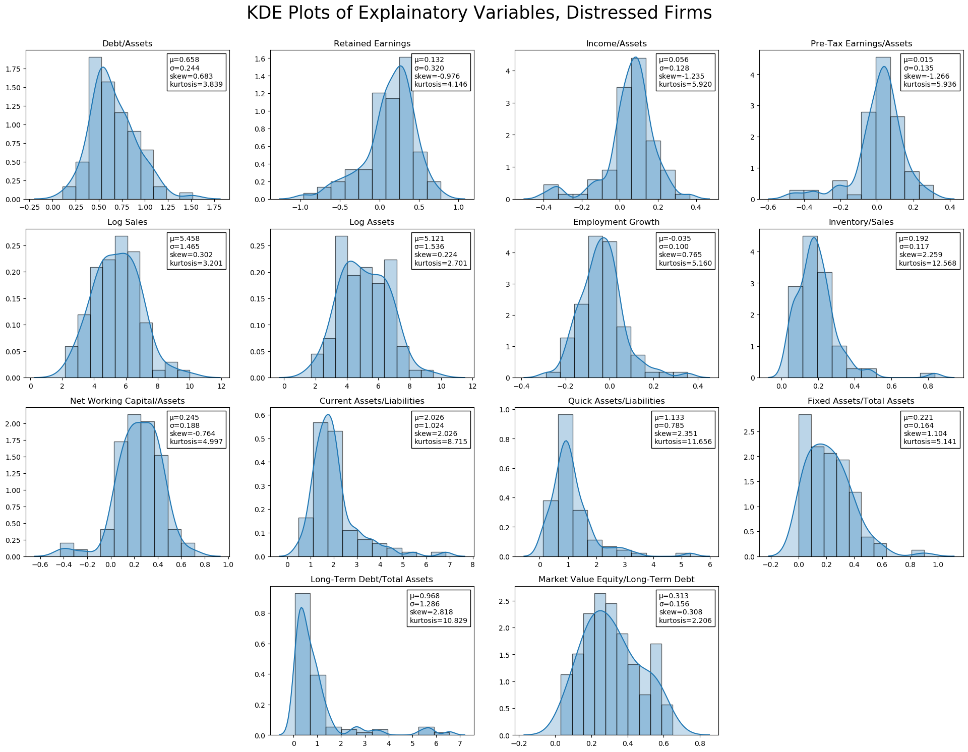
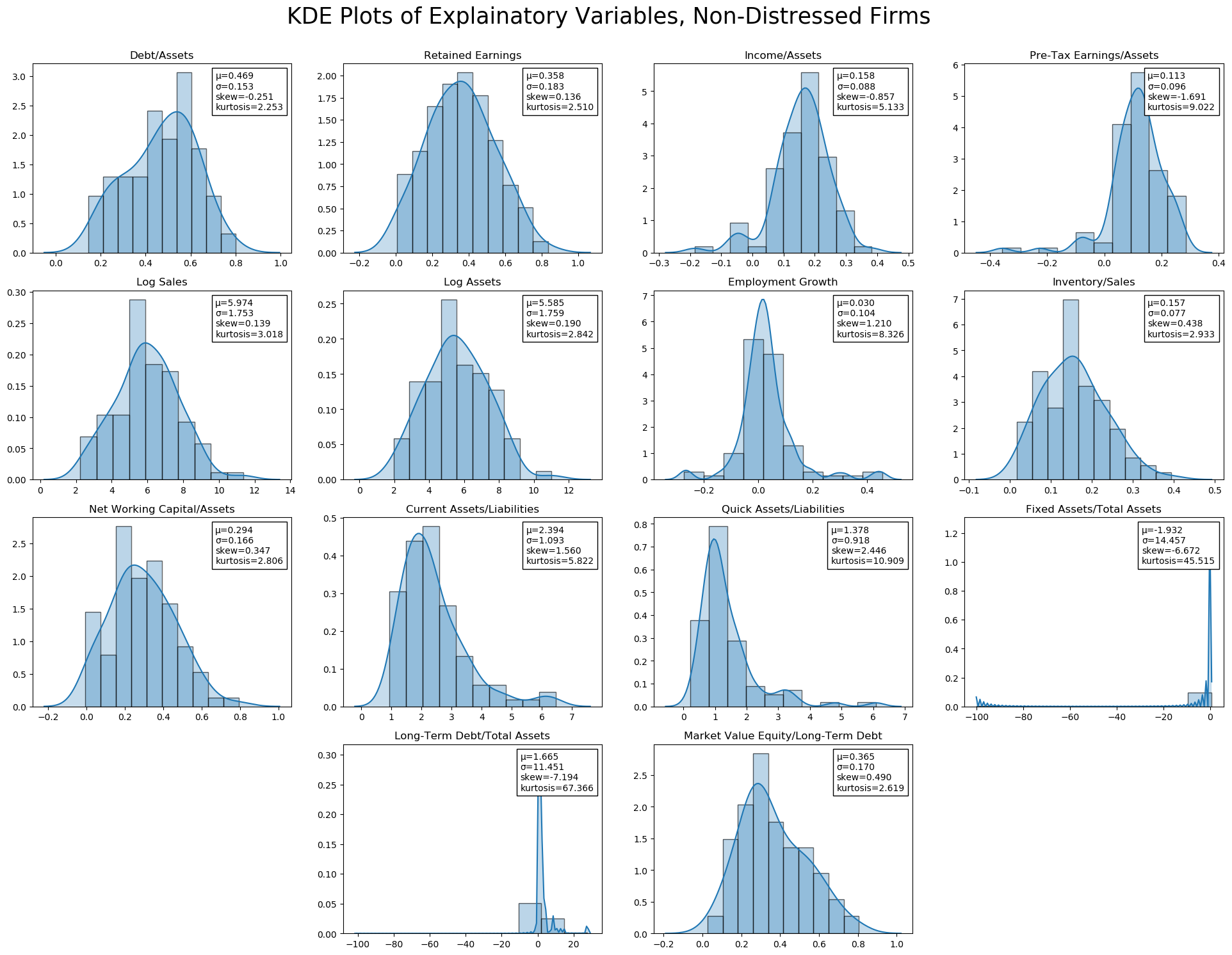
The majority of ratio statistics are between 0 and 1. Non-ratio variables, of course, have larger ranges (Log Sales, Log Assets. Fixed Assets/Total Assets and Long-Term Debt/Total Assets both seem to have a problem; the minimum value is -99.999999, which was likely a missing value code. Long-Term Debt/Total Assets also has a very high maximum, ~8$\sigma$ above the mean. Both are extremely leptokurtic as a result.
It seems reasonable to drop the -99 values (as negative Fixed to Total assets is impossible), though these could also be interpolated (this will be explored later).
Other than these obvious abnormalities, several variables are leptokurtic, including Income/Assets, Pre-Tax Earnings, and Inventory. Market Value Equity/Long-Term Debt, on the other hand, is platykurtic.
In terms of skew, Retained Earnings, Income/Assets, and Pre-Tax Earnings/Assets have negative (left) skew, while Debt/Assets, Inventory/Sales, and Long-Term Debt/Total Assets have significant positive (right) skew.
jesse_tools.kde_with_stats(X.loc[y[y == 1].index, :], X_train.columns, figsize=(8*3, 6*3),
               title='KDE Plots of Explainatory Variables, Distressed Firms')
jesse_tools.kde_with_stats(X.loc[y[y == 0].index, :], X_train.columns, figsize=(8*3, 6*3),
               title='KDE Plots of Explainatory Variables, Non-Distressed Firms')
Additional Exploration of Fixed Assets/Total Assets and Long-Term Debt/Total Assets
The presence of a potential missing code (-99) in Fixed Assets needs to be corrected. Two companies have this value, and they are dropped for now. Later, we can consider interpolation methods to attempt to preserve the observations (important, given the lack of data).
Long-Term Debt/Total Assets, on the other hand,does not obviously appear to be a mistake. The sign of the ratio is not incorrect, and while these seem to be extremely high debt ratios, it is certainly not impossible. Surprisingly, however, all three of these high long-term debt to assets firms are labeled as "not financially troubled".
Despite keeping these values, we can test if the results of estimate are driven by their inclusion, and consider alternatives.
X[['Fixed Assets/Total Assets', 'Long-Term Debt/Total Assets']].describe()
X[X['Fixed Assets/Total Assets'] < 0]
X[X['Long-Term Debt/Total Assets'] < 0]
two_sigma = X['Long-Term Debt/Total Assets'].mean() + X['Long-Term Debt/Total Assets'].std()*2
X[X['Long-Term Debt/Total Assets'] > two_sigma]
def drop_missing(X, y, variable, threshold, mode='<'):
    if mode == '<':
        to_drop = X[X[variable] < threshold].index
    elif mode == '>':
        to_drop = X[X[variable] > threshold].index
    return X.drop(index=to_drop), y.drop(index=to_drop)
X_train, y_train = drop_missing(X_train, y_train, 'Fixed Assets/Total Assets', 0, '<')
X_test, y_test = drop_missing(X_test, y_test, 'Fixed Assets/Total Assets', 0,  '<')
X_train, y_train = drop_missing(X_train, y_train, 'Long-Term Debt/Total Assets', 0, '<')
X_test, y_test = drop_missing(X_test, y_test, 'Long-Term Debt/Total Assets', 0,  '<')
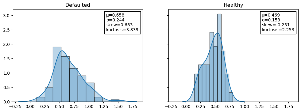
Comment on the Histograms of Total Debt/Assets for Default vs Healthy
As noted in class, the healthy distribution is much more normal than the defaulted. Defaulted firms skew slightly right, with high kurtosis. Only defaulted firms have values of Debt/Assets above 1, which is the source of the relative skew and kurtosis.
tdta_default = X['Debt/Assets'].loc[y[y == 1].index]
tdta_default.name = 'Defaulted'
tdta_healthy = X['Debt/Assets'].loc[y[y == 0].index]
tdta_healthy.name = 'Healthy'

compare_df = pd.merge(tdta_default, tdta_healthy, left_index=True, right_index=True, how='outer')
jesse_tools.kde_with_stats(compare_df, compare_df.columns, n=1, m=2, figsize=(12,4), title='', sharex=True, sharey=True)
What are the results of normality tests for Total Debt/Assets for Default and Healthy?
Results of a Jarque-Bera test of normality strongly reject the null hypothesis, data comes from a normal distribution, for the defaulted firms. The test fails to reject H0 for the healthy firms, indicating that this data is normally distributed.
print('Jarque-Bera Test of Normality:')
print('H0: Normal Distribution')
print(f'Healthy P-value: {stats.jarque_bera(tdta_healthy)[1]:0.3f}')
print(f'Defaulted P-value: {stats.jarque_bera(tdta_default)[1]:0.3f}')
An additional test of interest is the Kolomogorv-Smirnov test, which tests if two distributions come from the same underlying distribution. H0 is both random variables come from the same underlying distribution. Here also, we reject the null hypothesis, suggesting that failed firms' total debt/assets comes from a different (non-normal, based on the J-B test) distribution than that of healthy firms.
print('Kolomogorv-Smirnov Test of Distributional Equivilance:')
print('H0: Same Distribution')
print(f'Test statistic: {stats.ks_2samp(tdta_healthy, tdta_default)[1]:0.3f}')
print(f'P-value: {stats.ks_2samp(tdta_healthy, tdta_default)[1]:0.3f}')
Test equivilance of means using students test in 4 frameworks
The 4 student tests mentioned in class are the simple difference of means test, test of parameter $\beta$ in ANOVA, test of parameter $\beta$ in linear probability, and test of pearson's r. All four are considered here in turn.
Difference of Means Test
With a p-value of 0.000, the equality of means hypothesis is strongly rejected between the healthy and default debt/assets. It should be noted, however, that the student t-test has a strong normality assumption, which is violated in this case (see above).
print('Student T-Test of Equal Means:')
print('H0: μ_healthy - μ_default = 0')
print(f'Test statistic: {stats.ttest_ind(tdta_healthy, tdta_default)[0]:0.3f}')
print(f'P-value: {stats.ttest_ind(tdta_healthy, tdta_default)[1]:0.3f}')
ANOVA
We test a simple ANOVA between the Total Debt/Total Assets based on the value of the class label. Once again, the null hypothesis, that the population mean is equal, is rejected.
import statsmodels.api as sm

model = sm.OLS(X['Debt/Assets'], sm.add_constant(y), has_const=True).fit()
print('T-Test Recovered from ANOVA (Univariate Linear Model: X = α + βy + ϵ)')
print('H0: β = 0')
print('Note that if β=0, μ_healthy = μ_unhealthy = α')
print('='*50)
print(f'T-statistic: {model.tvalues[1]:0.3f}')
print(f'P-value: {model.pvalues[1]:0.3f}')
Linear Probability Model
The same t-statistic can be computed by putting y on the left-hand side of the regression and X on the right. Because y is a binary variable, this type of regression is called a linear probability model. The t-statistic is found to be the same, and is rejected at the 1% level of significance.
model = sm.OLS(y, sm.add_constant(X['Debt/Assets']), has_const=True).fit()
print('T-Test Recovered from Linear Probability Regression: y = α + βX + ϵ')
print('H0: β = 0')
print('='*50)
print(f'T-statistic: {model.tvalues[1]:0.3f}')
print(f'P-value: {model.pvalues[1]:0.3f}')
Pearson's R
A final method of computing the same t-statistic is by using pearson's R, defined as:
$$ \rho(x,y) = \frac{\mathbb{E}\left[(x - \bar{x})(y - \bar{y})\right]}{\sigma_x \sigma_y}$$In this case, the P-value matches that found in the linear probability model to 22 decimal places (they are equal, save for floating-point imprecision). In addition, we note that the test statistic is equal to the square root of the LPM $r^2$.
pear = stats.pearsonr(y, X['Debt/Assets'])[0]
pval = stats.pearsonr(y, X['Debt/Assets'])[1]

print(f"Pearson's R: {pear:0.4f}")
print(f"P-value: {pval:0.4f}")
print(f'Difference between Pearson P-value and LPR P-value: {pval - model.pvalues[1]}')
print(f'Sqrt Linear Probability Regression r^2: {np.sqrt(model.rsquared):0.4f}')
Box Plots for Each Independent Variable
Box plots for all independent variables (financial ratios) are presented independently for defaulting firms and non-defaulting firms. Variables are sorted by their variance. Note that the ordering of variance is not the same in both groups. Log Sales and Log Assets are more volatile in distressed companies than in non-distressed ones, while non-distressed firms have several Long-Term Debt/Total Asset outliers (as was noted above).
fig, axes = plt.subplots(2, 1, figsize=(16,12), dpi=100, sharex = False)

for i, ax in enumerate(axes):
    data = X.loc[y[y == i].index].copy()
    data, _ = drop_missing(data, y, 'Fixed Assets/Total Assets', 0)
    data, _ = drop_missing(data, y, 'Long-Term Debt/Total Assets', 0)

    sorted_by_std = data.std().argsort()

    sns.boxplot(data=data[data.columns[sorted_by_std]], ax=ax)
    ax.tick_params(axis='x',
                 rotation=90)
    for spine in ax.spines.values():
        spine.set_visible(False)
    if i == 0: title = 'No Financial Distress'
    if i == 1: title = 'Financial Distress'

    ax.grid(ls='--', lw=0.5)
    ax.set_title(f'Box Plot for All Independent Variables, {title}', fontsize=16)
fig.tight_layout()
plt.show()

Because the 5 right-most variables have ranges much greater than all the other financial ratios, they are difficult to comment on. As a result, these ratios are plotted again separately. In addition, rather than sorting each group by it's own standard deviation, both plots have been sorted by the variance of only the no distress. This should allow for easier direct comparison between variables.
In this plot, several differences become apparent:
- In almost all cases, ratios of distressed firms have lower means and a narrower 1st-3rd quartile box
- Debt/Assets is significantly higher for distressed firms; it's 1st quartile value is equal to the mean value of the same ratio for healthy firms
- Fixed Capital and Net Working Asset ratios do not appear to be significantly different between the two groups
- Retained Earnings are much lower for financially distressed firms (1st Quartile = Healthy Mean - IQR * 1.5!!) plus outliers
fig, axes = plt.subplots(2, 1, figsize=(16,12), dpi=100, sharex = True, sharey = True)

for i, ax in enumerate(axes):
    data = X.loc[y[y == i].index].copy()
    data, _ = drop_missing(data, y, 'Fixed Assets/Total Assets', 0)
    data, _ = drop_missing(data, y, 'Long-Term Debt/Total Assets', 0)

    if i == 0:
        sorted_by_std = data.std().argsort()

    sns.boxplot(data=data[data.columns[sorted_by_std][:-5]], ax=ax)
    ax.tick_params(axis='x',
                 rotation=90)
    for spine in ax.spines.values():
        spine.set_visible(False)
    if i == 0: title = 'No Financial Distress'
    if i == 1: title = 'Financial Distress'

    ax.set_title(f'Box Plot for Selected Independent Variables, {title}', fontsize=16)
    ax.grid(ls='--', lw=0.5)
fig.tight_layout()
plt.show()

Bivariate Correlation with the Dependent Variable
Results are slightly different from the Do-file of Professor Chatelain because the -99.99 observations have been dropped.
The majority of variables are strongly significant, with expected signs. More debt/assets increases probability of default, as does a larger inventory/sales (implies lower sales volume, or an inability to accurately forecast demand).
Higher retained earnings and more income/assets strongly predict health (both make sense as a buffer against negative exogenous shocks), as does Pre-Tax earnings (likely to be strongly correlated with Retained Earnings) and Employment Growth. Employment growth is a bit surprising, as the box plots above did not reveal a significant difference between the two groups -- both means are very close to 0, with a similar IQR (~-0.2 to 0.2)
Of all the ratios, only Fixed Assets/Total Assets is not correlated with Default at the 10% level. This could be due to the specific sectors included in the dataset; the level of Fixed Assets to Total Assets varies strongly across sectors, and if all industries are, for example, in manufacturing, they will necessarily all have a similar level of capital assets (factories, machinery, etc.)
X_vars = X.columns
n = len(X_vars)
p_values = np.zeros((n,1))
output = np.zeros((n,1))

X_data, y_data = drop_missing(X, y, 'Fixed Assets/Total Assets', 0)
X_data, y_data = drop_missing(X, y, 'Long-Term Debt/Total Assets', 0)

for i,var1 in enumerate(X_vars):
    output[i] = stats.pearsonr(X_data[var1], y_data)[0]
    p_values[i] = stats.pearsonr(X_data[var1], y_data)[1]

output = pd.DataFrame(output, columns = ['Defaulted'], index=X_vars)
p_values = pd.DataFrame(p_values, columns = ['Defaulted'], index=X_vars)
new_out = pd.DataFrame()

for col in output.columns:
    temp = jesse_tools.add_stars(output[col], p_values[col])
    temp.name = col
    new_out = pd.concat([new_out, temp], axis=1)
new_out.index = [x for x in output.index]
new_out.columns = [x for x in new_out.columns]

print('Simple Correlation Matrix for Between Transformed Variables')
print('='*110)
print(new_out)
print('\n')
print('*** - p < 0.01, ** - p < 0.05, * - p < 0.01')
print('Note: Pearson\'s correlation coefficient assumes normally distributed variables')
Bivariate Correlation Between Regressors
In the bivariate correlation table, several extremely strongly correlated variables are identified:
- Debt/Assets and Retained Earnings, $\rho = -0.825$
- Income/Assets and Pre-Tax Earnings, $\rho = .976$
- Log Sales and Log Assets, $\rho = .957$
- Current Assets/Liabilities and Quick Assets/Liabilities, $\rho = .880$
These are not surprising, and are the result of accounting identities. Recalling that Retained Earnings = Last Period RE + Net Income - Cash Dividend - Stock Dividend, it is easy to see that debt, in the form of negative last-period RE, enters into the RE equation.
In the second case, it is clear that pre-tax earnings is essentially identical to income.
Log Sales and Log Assets is a bit more surprising.
Quick Assets and Current Assets are very similar, and it makes sense that a company with a lot of Current Assets (e.g., accounts receivable) would also have a lot of quick assets (e.g., cash on hand).
Depending on our objective, we can include these variables or not. They are collinear pairs, and will cause the coefficients on the pair to be biased and individually uninterpretable. If we are interested in estimating the impact of individual variables, we should not include both. If we are only interested in prediction accuracy, however, both can be included to test if the additional variance improves out-of-sample mean squared error.
jesse_tools.corr_table(X_data, X.columns)
Scatter Plots for Selected Variables
The scatter plots below match very well the correlation coefficients reported above. Retained Earnings and Debt/Assets, and Pre-Tax Earnings/Income and Income/Assets can both be seen to be collinear. The strong positive correlation and strong negative correlation between Debt/Assets and Financial Difficulty and Retained Earnings and Financial Difficulty, respectively, are also visible.
Unhappily, none of the variables are cleanly linearly separable, which will make logit/probit estimation struggle to classify in these dimensions.
import warnings

with warnings.catch_warnings(record=True):
    X_vars = ['Financial Difficulty', 'Debt/Assets', 'Retained Earnings', 'Income/Assets', 'Pre-Tax Earnings/Assets',
             'Employment Growth']
    g = sns.pairplot(pd.merge(X_data, y_data, left_index=True, right_index=True),
                 hue='Financial Difficulty', hue_order=[1,0], vars=X_vars, kind='scatter',
                     diag_kind='kde', palette='Set1', corner=True)
    g.fig.suptitle('Scatter Plot for Selected Variables, with KDE Plots', fontsize=24, y=0.9, x=0.45)
    g.fig.axes[0].set_visible(False)
    g.fig.legends[0].set(bbox_to_anchor=(0.5,0.85), transform=g.fig.transFigure)
    g.fig.legends[0]._ncol = 2

    plt.show()

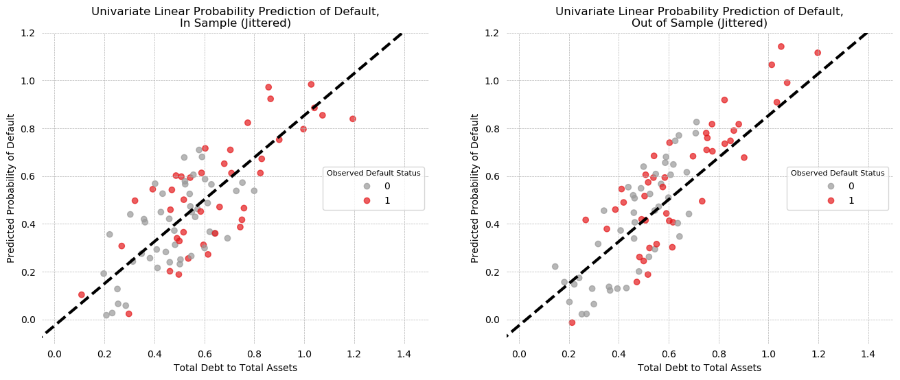
Univariate Linear Probability Model
The following model is trained using the training data. The data was sorted on Debt/Assets, and every 2nd observation was added to the test set. The following model was estimated using the remaining observations:
$$ \text{Default}_i = \beta_{0} + \beta_{1} \cdot \frac{\text{Total Debt}}{\text{Total Assets}}_i + \epsilon_i$$Note that there are 89 observations in the training set. This is the 91 reported above, minus the 2 mis-codings that were dropped. The model has an $r^2$ of .165. The coefficient on Debt/Assets is significant at the 1% level and positive, in line with our expectation that greater debt leads to a more precarious financial situation.
Diagnostic statistics for the residuals are also reported. The Jarque-Bera test of normally distributed residuals is rejected at the 5% level, which is expected given what we know about the distributions. Residuals are leptokurtic, with a slight positive skew. The Durbin-Watson test can be interpreted as a test of heteroskedasticity in this context, to test if residuals are correlated in Debt/Asset space. The usual rule of thumb is to consider a D-W result less than 1 as a sign of potential autocorrelation (in this case, heteroskedasticity or serial correlation). Here we see a statistic of nearly 2, suggesting that while not normally distributed, information about an error does not necessarily provide information about the value of the surrounding errors.
X_train['Constant'] = 1
X_test['Constant'] = 1
lpm = sm.OLS(y_train, X_train[['Constant', 'Debt/Assets']], has_constant=True).fit()
print(lpm.summary())
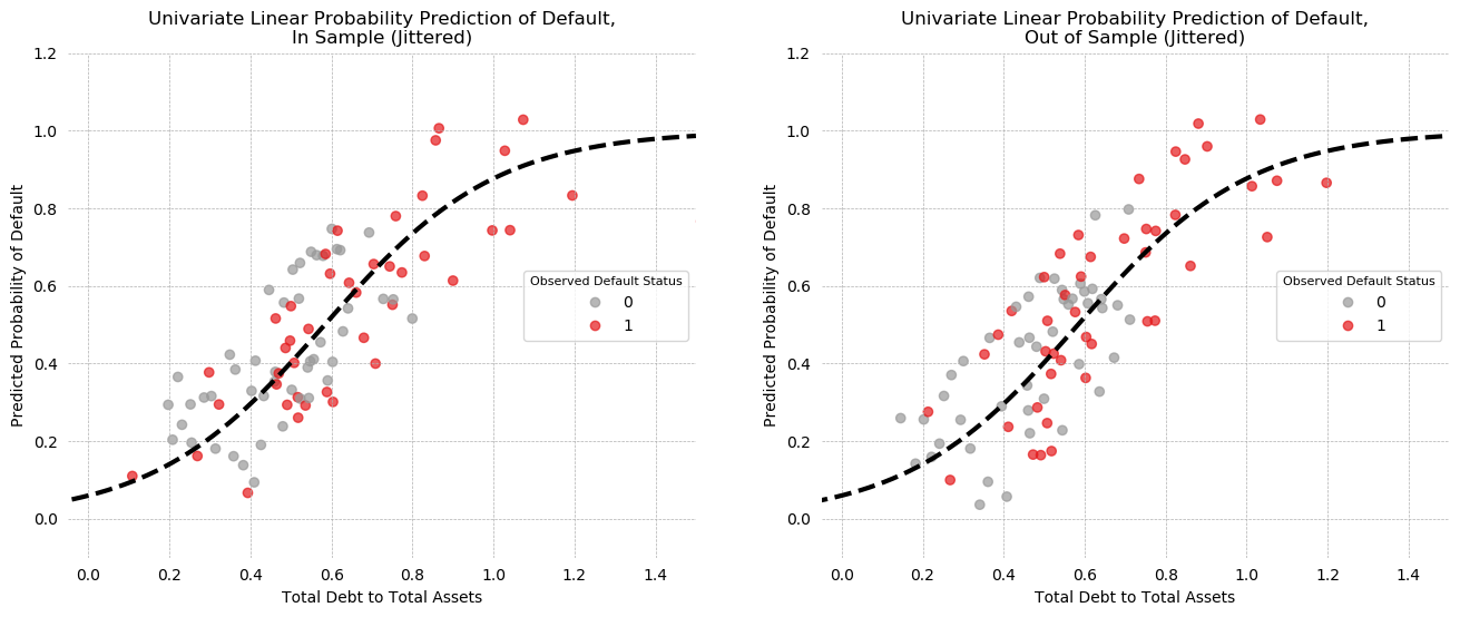
Univariate LPM Predictions
The predictions of the model are plotted below, for both In-Sample (left) and out-of-sample (right) prediction, with some jitter to help visibility.
On the in-sample plot, there appears to be a large cluster of correct positive predictions in the north-east quadrant of the plot, but the south-west does not have a similar cluster of correct negatives. Looking at the KDE plots of Debt/Assets above, it is easy to see why: the distributions overlap at low values and only begin to separate around 0.8.
The out of sample plot is similar, with some separation of the positive class in the NE, but intermixing throughout otherwise.
train_jitter = np.random.uniform(-0.25, 0.25, X_train.shape[0])
test_jitter = np.random.uniform(-0.25, 0.25, X_test.shape[0])
fig, axes = plt.subplots(1, 2, figsize=(8*2,6), dpi=100)

for X_frame, y_frame, ax, name, jitter in zip([X_train, X_test], [y_train,  y_test],
                                              fig.axes, ['In Sample', 'Out of Sample'],
                                             [train_jitter, test_jitter]):
    scatter = ax.scatter(X_frame['Debt/Assets'],
                         lpm.predict(X_frame[['Constant', 'Debt/Assets']]) + jitter,
                                                            c=y_frame, cmap='Set1_r', alpha=0.7)
    ax.grid(ls='--', lw=0.5)
    jesse_tools.remove_chart_ink(ax)
    x = np.linspace(-0.5, 1.5, 100)
    ax.plot(x, lpm.params[0] + lpm.params[1] * x,
            ls='--', color='black', lw=3)
    ax.legend(*scatter.legend_elements(), loc='right', bbox_transform=ax.transAxes,
               title='Observed Default Status', frameon=True, title_fontsize=8)
    ax.set_xlabel('Total Debt to Total Assets')
    ax.set_ylabel('Predicted Probability of Default')
    ax.set_title(f'Univariate Linear Probability Prediction of Default,\n{name} (Jittered)')

    ax.set(ylim=(-0.1, 1.2), xlim=(-0.05, 1.5))
plt.show()
Univariate LPM Confusion Matrices
By considering classification thresholds, confusion matrices can be generated. By iterating over thresholds and testing a metric of interest, an optimal threshold can be identified. Here, accuracy is used to identify an optimum threshold. In-sample, Accuracy is maximized at 70% with a 53% threshold, while out-of-sample accuracy is maximized to the same value at a 60% threshold.
from sklearn.metrics import accuracy_score

for title, X_frame, y_frame in zip(['In Sample', 'Out of Sample'], [X_train, X_test], [y_train, y_test]):
    max_accuracy = 0
    best_threshold = 0
    for threshold in np.linspace(0, 1, 100):
        pred = np.array([1 if x > threshold else 0 for x in lpm.predict(X_frame[['Constant', 'Debt/Assets']])])
        accuracy = accuracy_score(y_frame, pred)
        if accuracy > max_accuracy:
            max_accuracy = accuracy
            best_threshold = threshold
    print(f'{title} Prediction:')
    print('='*(len(title) + 12))
    print(f'Maximum Accuracy Achieved: {max_accuracy:0.4f}')
    print(f'Associated threshold: {best_threshold:0.4f}')
    if title == 'In Sample':
        print('\n')
To see the effect of varying the threshold, we consider only the in-sample model at two thresholds. At the 50% threshold, the LPM in-sample performance is better than a dummy classifier that always guesses the majority class (max(prevalence, 1-prevalence) = 52%, LPM accuracy = 66%). The model is much more likely to make Type 1 errors than Type 2 errors (Precision > Recall).
By using the maximum accuracy threshold of 53.5%, 5 false positive observations are now correctly classified as negatives, at the cost of 2 positive predictions becoming false negatives. This shows the arbitrage between type 1 and type 2 errors, which is summarized in the precision and recall trade-off. Note that accuracy has gone up because precision, minimization of type 1 errors, went up by more than recall, minimization of type 2 errors, went down (precision +.12, recall -.05).
It is not clear that accuracy is the score we should want to maximize over. Depending on the shareholder, different metrics might be important. For an investor, putting money into a company that will fail has a much higher cost than the opportunity cost of not investing in a firm presumably on the edge of solvency. Thus, minimization of type 2 errors (when the model predicts a failing company is solvent) is more important than minimization of type 1 errors (which cause him to miss an opportunity). On the other hand, a policymaker might believe that over-regulation harms growth. If she uses this model to decide which firms should be targeted for greater regulatory oversight, she may want a model that is more prone to allowing creative destruction, via minimization of type 1 errors (missing insolvent firms), rather than one that is over-cautious and imposes regulatory burden on healthy companies.
The F-beta score provides a nice way to model different kinds of stakeholders, and will be discussed more in question 18. For now, the F1 score, which is the harmonic mean of precision and recall, is reported in my confusion matrices.
pred_50 = np.array([1 if x > .5 else 0 for x in lpm.predict(X_train[['Constant', 'Debt/Assets']])])
s, _, pred_max = optimize_threshold(X_train[['Constant', 'Debt/Assets']], y_train, lpm, 'accuracy')

jesse_tools.confusion_matrix_two('Linear Probability - In Sample',
                                 jesse_tools.score_classifier(y_train, pred_50),
                                 jesse_tools.score_classifier(y_train, pred_max),
                                 subtitle1='50% threshold',
                                 subtitle2=f'{s*100:0.1f}% threshold')
Moving to a comparison of in- and out-of-sample prediction, confusion matrices for each data subset are presented, with an accuracy maximized threshold for each used. Both models have the same accuracy, but very different precision and recall scores. The out-of-sample model makes no type 1 errors at all, but at the cost of additional type 2 errors.
s1, _, pred_train = optimize_threshold(X_train[['Constant', 'Debt/Assets']], y_train, lpm, 'accuracy')
s2, _, pred_test = optimize_threshold(X_test[['Constant', 'Debt/Assets']], y_test, lpm, 'accuracy')
jesse_tools.confusion_matrix_two('Linear Probability - Accuracy Maximized Thresholds',
                                 jesse_tools.score_classifier(y_train, pred_train),
                                 jesse_tools.score_classifier(y_test, pred_test),
                                 subtitle1=f'In Sample, s={s1*100:0.1f}%',
                                 subtitle2=f'Out of Sample, s={s2*100:0.1f}%' )
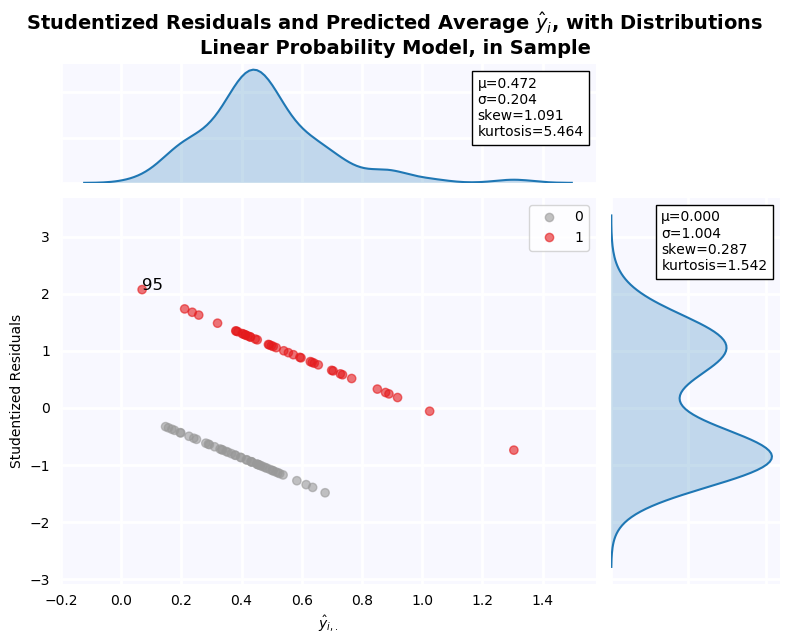
Residuals of the Linear Probability Model
From the residual plot below, it is clear that residuals are not normally distributed. The distribution is bimodal and platykurtic with slight positive skew. This is, of course, an artifact of the model specification, which amounts to a discriminant analysis. The residuals are expected to be a mixture of the distributions of Debt/Assets when Defaulted = 1 and 0, and indeed, this is what we see.
jesse_tools.resid_plot(X_train[['Constant', 'Debt/Assets']],
                       lpm,
                       y = None,
                       y_hat = lpm.predict(X_train[['Constant', 'Debt/Assets']]),
                       resids = lpm.resid,
                       title='Linear Probability Model, in Sample', color_col=y_train, cmap='Set1_r',
                       outlier_y = [-2, 2],
                       labels_y=True)
Univariate Logit Model
Next a logistic model is fit:
$$y_i = \sigma \left(\beta_{0} + \beta_{1} \cdot \frac{\text{Total Debt}}{\text{Total Assets}}_i + \epsilon_i\right)$$with:
$$\sigma(x) = \frac{1}{1 + e^{-x}}$$The main advantage being that the activation function g(x) constrains model output to 0,1, which can create a more "realistic" output. It also permits a smooth non-linear transition from a zone of confident class = 0 prediction to high class = 1 prediction.
Regression
The Pseudo r^2 for the model is .14, which is lower than the LPM but not by much (these are also not computed the same way, so direct comparison is difficult). The Debt/Assets coefficient is for 4.7 and significant at the 1% level. This is much larger than the .87 coefficient found by the LPM, because the value is reported in log-odds. If we compute:
$$\text{logit}(-2.7495 + 4.7138) - \text{logit}(-2.7495) = .816$$We see that an increase in Debt/Assets from 0 to 1 is associated with an increase in probability quite close to that found by the LPM.
u_logit = sm.Logit(y_train, X_train[['Constant', 'Debt/Assets']]).fit()
print(u_logit.summary())
stats.logistic.cdf(u_logit.params[0] + u_logit.params[1]) - stats.logistic.cdf(u_logit.params[0])
Predicted Probability Plots
Predictions for the logit model are plotted below, with the same jitter values applied as in question 10 (to facilitate comparison). The patterns in in plot are largely similar: there model correctly assigns high probability to a cluster of defaulted firms, but on the low probability side firms are more mixed. There is an outlier in the training group assigned p=0 despite being defaulted.
fig, axes = plt.subplots(1, 2, figsize=(8*2,6), dpi=100)

for X_frame, y_frame, ax, name, jitter in zip([X_train, X_test], [y_train,  y_test],
                                      fig.axes, ['In Sample', 'Out of Sample'], [train_jitter, test_jitter]):
    scatter = ax.scatter(X_frame['Debt/Assets'],
                         u_logit.predict(X_frame[['Constant', 'Debt/Assets']]) + jitter,
                                                            c=y_frame, cmap='Set1_r', alpha=0.7)
    ax.grid(ls='--', lw=0.5)
    jesse_tools.remove_chart_ink(ax)
    x = np.linspace(-0.5, 1.5, 100)
    ax.plot(x, 1/(np.e **(-(u_logit.params[0] + u_logit.params[1] * x)) + 1),
            ls='--', color='black', lw=3)
    ax.legend(*scatter.legend_elements(), loc='right', bbox_transform=ax.transAxes,
               title='Observed Default Status', frameon=True, title_fontsize=8)
    ax.set_xlabel('Total Debt to Total Assets')
    ax.set_ylabel('Predicted Probability of Default')
    ax.set_title(f'Univariate Linear Probability Prediction of Default,\n{name} (Jittered)')

    ax.set(ylim=(-0.1, 1.2), xlim=(-0.05, 1.5))
plt.show()
Confusion Matrices, Maximum Accuracy Threshold
Despite the concerned noted above, threshold is once again maximized for accuracy. Once again, maximum achievable accuracy is the same both in-sample and out of sample, but that out-of-sample has lower recall and higher precision. Like the LPM, this model is prone to Type 2 errors. In fact, out of sample, the model makes ONLY type 2 errors when accuracy is maximized. This comes at the cost of fewer correct positive classifications, but more correct negative classifications.
s1, _, pred_train = optimize_threshold(X_train[['Constant','Debt/Assets']],y_train, u_logit, 'accuracy')
s2, _, pred_test = optimize_threshold(X_test[['Constant','Debt/Assets']],y_test, u_logit, 'accuracy')

jesse_tools.confusion_matrix_two('Univariate Logit - Accuracy Maximized Thresholds',
                                 jesse_tools.score_classifier(y_train, pred_train),
                                 jesse_tools.score_classifier(y_test, pred_test),
                                 subtitle1=f'In Sample, s={s1*100:0.1f}%',
                                 subtitle2=f'Out of Sample, s={s2*100:0.1f}%' )
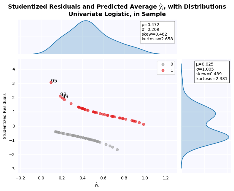
Residual Plot
The residuals in this plot have been studentized using a different formula than those of the LPM. In the LPM case, the studentization formula used was:
$$t = \frac{(y-\hat{y})}{\sigma \sqrt{1 - h_{ii}}}$$Where $h_{ii}$ is the diagonal of the design matrix $X (X^T X)^{-1} X^T$
Here, another specification is used:
$$t = \frac{(y-\hat{y})}{\sqrt{\hat{y}\,(1-\hat{y})}}$$Because $\hat{y}$ is a probability in $(0,1)$, this formula is preferred. In the LPM, $\hat{y}$ can be greater than 1, causing the square root in the denominator to be undefined. As a result, the residuals are quite different. We two outliers with standardized residual greater than 1.96: Firms 95, 98, and 99. Firm 95 has the lowest Debt/Asset ratio in the dataset, but is classified as not distressed. As a result, the residuals are relatively large. Firms 98 and 99 are a bit more surprising, because their Debt/Assets ratio is not 1.96$\sigma$ from the within-class mean. The model seems very sensitive to even 1-sigma deviation, but it would be unreasonable to consider variables 1-sigma from the mean as outliers.
jesse_tools.resid_plot(X_train[['Constant', 'Debt/Assets']],
                       model=None,
                       resids=None,
                       y = y_train,
                       y_hat=u_logit.predict(X_train[['Constant', 'Debt/Assets']]),
                       outlier_y = [-1.96, 1.96],
                       labels_y=True,
                       title='Univariate Logistic, in Sample', color_col=y_train, cmap='Set1_r')
print('Financial Distress = 1 Firms')
print('='*30)
print(X_train[y_train == 1]['Debt/Assets'].describe()[['mean', 'std', 'min']].to_string())
print(f"μ - 1.96σ = {X_train[y_train == 1]['Debt/Assets'].mean() - 1.96*X_train[y_train == 1]['Debt/Assets'].std():0.4f}")
print('\n')
print('Financial Distress = 0 Firms')
print('='*30)
print(X_train[y_train == 0]['Debt/Assets'].describe()[['mean', 'std', 'min']].to_string())
print('\n')

print(f"Debt/Assets Ratio of Firm 95:  {X_train.loc[95, 'Debt/Assets']:0.3f}", " "*5, f'Class Label: {y_train[95]}')
print(f"Debt/Assets Ratio of Firm 98:  {X_train.loc[98, 'Debt/Assets']:0.3f}", " "*5, f'Class Label: {y_train[98]}')
print(f"Debt/Assets Ratio of Firm 99:  {X_train.loc[99, 'Debt/Assets']:0.3f}", " "*5, f'Class Label: {y_train[99]}')
Compare the Estimates of Probit and Logit for the Univariate Model
The univariate model is once again estimated, this time with a probit activation function:
$$ y_i = \Phi \left(\beta_0 + \beta_1 \cdot \frac{\text{Total Debt}}{\text{Total Assets}}_i + \epsilon \right ) $$with
$$\Phi(x) = \frac{1}{2} \left[ 1 + \frac{2}{\pi} \int_{0}^{\frac{x - \mu}{\sigma\sqrt{2}}} e^{-s^2} ds \right]$$Similar to the logit model, use of this activation function, with image in (0,1), allows us to constrain the output of the model to probabilities.
Once again, the value on the coefficient is quite different from either the LPM (.87) or the Logit model (4.71). If we compute the difference of a normal cumulative distribution at $\beta_0$ and $\beta_0 + \beta_1$, however, we find:
$$\Phi(-1.6414 + 2.8282) - \Phi(-1.6414) = .831$$The marginal probability associated with going from Debt/Assets = 0 to Debt/Assets = 1 is .83, which is nearly the coefficient of the LPM, and very close to the marginal probability computed from the logit model (.81).
Difference in coefficient value, thus, is due to the activation function (or link function) used to model the latent variable. When no linking function is used, in the LPM case, we directly recover a marginal probability. When either a probit or logit linking function is used, however, coefficients are reported as outputs of that function, and cannot be directly compared. They must be first converted back to marginal probability estimates using an appropriate function.
One note, however, is that because these link functions are non-linear, the marginal effect of a unit increase in an explanatory variable will not be constant in that variable space, as is the case with an LPM. To correctly measure the impact of changes in a variable, we need to measure change around a value of interest.
u_probit = sm.Probit(y_train, X_train[['Constant', 'Debt/Assets']]).fit()
print(u_probit.summary())
stats.norm.cdf(u_probit.params[0] + u_probit.params[1]) - stats.norm.cdf(u_probit.params[0])
jesse_tools.resid_plot(X_train[['Constant', 'Debt/Assets']],
                       model=None,
                       resids=None,
                       y = y_train,
                       y_hat=u_probit.predict(X_train[['Constant', 'Debt/Assets']]),
                       outlier_y = [-1.96, 1.96],
                       labels_y=True,
                       title='Univariate Logistic, in Sample', color_col=y_train, cmap='Set1_r')

How can the percentage of concordant pairs be obtained?
A binary dependent variable is no barrier to finding concordant pairs. To find concordant pairs, we compare each y=0 observation with each y=1 observation for a total of $N_{y=0} \cdot N_{y=1}$ pairs of points. For each pair of points $s \in y=0, v \in y=1$, we call s and v concordant if $y_s > y_v$ and $\hat{y}_s > \hat{y}_v$. Because we restrict our choice of s and v to different groups, there can be a tie only if $\hat{y}_s =\hat{y}_v$. In the unlikely case that there is a tie, it is ignored in the final tally.
from itertools import product
concordent = 0
discordent = 0
x_tie = 0
y_tie = 0
tied_pairs = []
default_group = y_train[y_train == 1]
nondefault_group = y_train[y_train == 0]

pairs = list(product(default_group.index, nondefault_group.index))
for pair in pairs:
    y_true1, y_true2 = y_train.loc[pair[0]], y_train.loc[pair[1]]
    y_hat1, y_hat2 = u_logit.predict(X_train.loc[pair[0], ['Constant', 'Debt/Assets']].values),\
                     u_logit.predict(X_train.loc[pair[1], ['Constant', 'Debt/Assets']].values)

    if ((y_true1 > y_true2) & (y_hat1 > y_hat2)) | ((y_true1 < y_true2) & (y_hat1 < y_hat2)):
        concordent += 1
    elif ((y_true1 > y_true2) & (y_hat1 < y_hat2)) | ((y_true1 < y_true2) & (y_hat1 > y_hat2)):
        discordent += 1
    elif (y_true1 == y_true2) & (y_hat1 != y_hat2):
        y_tie += 1
    elif (y_true1 != y_true2) & (y_hat1 == y_hat2):
        x_tie += 1

print(f'Concordant pairs: {concordent} out of {len(pairs)} = {concordent / len(pairs):0.4f}')
print(f'Discordant pairs: {discordent} out of {len(pairs)} = {discordent / len(pairs):0.4f}')
ROC-AUC Curves for Univariate Models
ROC-AUC curves are plotted below. Each model has the same AUC score: 0.722 in-sample, and 0.727 out-of-sample. The slightly higher score out-of-sample is an indication that our model is underfit, and additional variables should be added, as it is currently extremely sensitive to changes in the data.
We can also notice that the AUC score presented in the graph is identical to the fraction of concordant pairs at 3 decimal places. The Scikit-learn function used to compute AUC uses trapezoid integral estimation, so this is arriving at the same number two different ways. Below, concordant pairs and AUC are compared to the full length of the floating point. They are found to be identical to 16 decimal places, that is, exactly the same.
from matplotlib import cm
from sklearn.metrics import roc_auc_score, roc_curve

fig, ax = plt.subplots(1, 2, figsize=(12,6), dpi=100)
X_vars = ['Constant', 'Debt/Assets']

for model, name, color in zip([lpm, u_logit, u_probit], ['Linear', 'Logit', 'Probit'], cm.tab10([0, .2, .4])):
    for X_frame, y_frame, axis in zip([X_train, X_test], [y_train, y_test], fig.axes):
        tpr = []
        fpr = []
        for threshold in np.linspace(0,1,100):
            y_hat = [1 if x > threshold else 0 for x in model.predict(X_frame[X_vars])]
            TP, FP, FN, TN = jesse_tools.score_classifier(y_frame, y_hat)
            tpr.append(TP/(TP + FN))
            fpr.append(FP/(FP + TN))
        score = roc_auc_score(y_frame, model.predict(X_frame[X_vars]))
        axis.plot(fpr, tpr, label = f'{name} AUC = {score:0.3f}', color=color, alpha=1)
        axis.plot([0,1], [0,1], ls='--', lw=0.5, color='red')
        axis.set(xlim=(-0.05,1.05), ylim=(-0.05, 1.05))
        jesse_tools.remove_chart_ink(axis)
        axis.grid(ls='--', lw=0.5)
        axis.set_ylabel('True Positive Rate (Recall)')
        axis.set_xlabel('False Positive Rate (Fall-out)')
        if (X_frame.values == X_train.values).all():
            axis.set_title('In-Sample')
        else:
            axis.set_title('Out-of-Sample')
        axis.legend(loc='best', fontsize=8)
fig.suptitle('ROC-AUC Curves for 3 Univariate Models, In- and Out-of-Sample')
plt.show()
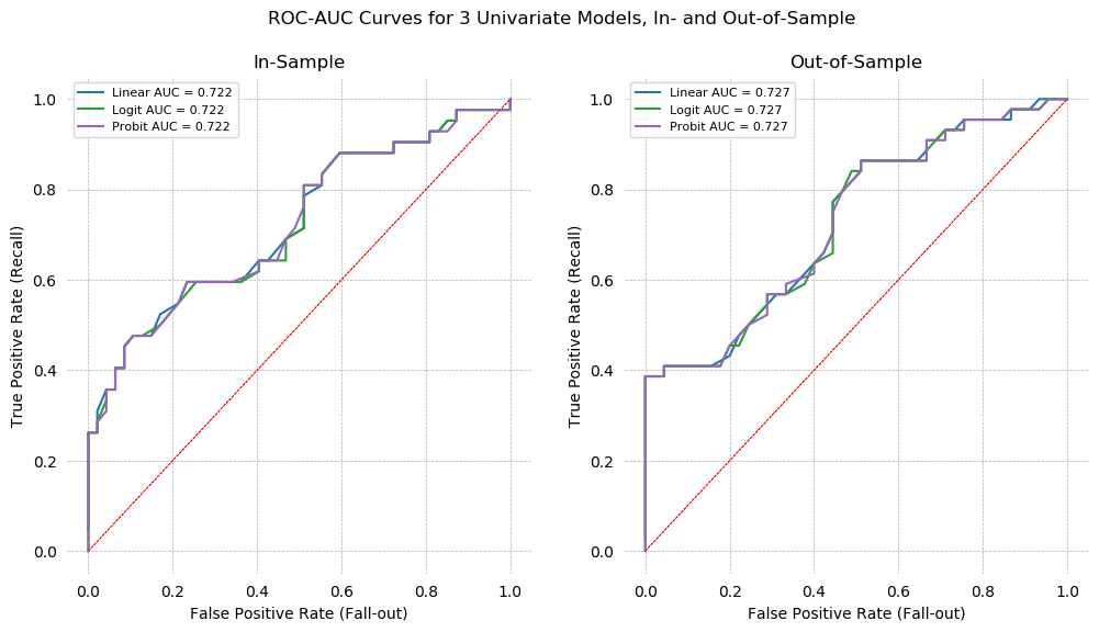
print(f'Concordant pairs: {concordent / len(pairs)}')
print(f'AUC: {roc_auc_score(y_train, lpm.predict(X_train[X_vars]))}')
print(f'Difference: {concordent / len(pairs) - roc_auc_score(y_train, lpm.predict(X_train[X_vars]))}')
Multivariate Logit Regression
Given 15 financial ratios, we need to choose a subset that has the best explanatory power.
We have already seen that all ratios except for Quick Assets/Total Liabilities are correlated with Default. This suggests simply adding everything to a model might work, but we also know that 3 pairs of variables, Log Assets and Log Sales, Debt/Assets and Retained Earnings, and Pre-Tax Income and Income/Assets are highly correlated. These pairs will definitely cause slope estimates to be baised due to endogeneity among the explanatory variables. Nevertheless, we are interested with out of sample prediction, not causal inference. It also known that by adding additional variables, out-of-sample predictions become worse (curse of dimensionality). Therefore a parsimonious model can be preferable, especially given our overall lack of data. With only ~90 observations in the training set, 15 variables may be too many.
To select variables, several metrics will be used.
- Simple Correlation
- PCA
- Decision Tree
- Stepwise-in
- Recursive Feature Elimination
Simple Correlation
Simple correlations with Default status are repeated here for reference. The top 4 correlations are much greater than the 5-14th, suggesting these might be a good place to start modeling. Unfortunately, these 4 variables are 2 of the highly correlated pairs identified above. Although the parameter estimates will not be reliable, this combination may still produce useful predictions.
X_vars1 = X_train.corrwith(y_train).apply(np.abs).sort_values(ascending=False).index.tolist()
X_vars1.insert(0, 'Constant')
X_vars1 = X_vars1[:-1]

X_train.corrwith(y_train)[X_vars1].dropna()
X_train[X_vars1[1:5]].corr()
PCA for Variable Selection
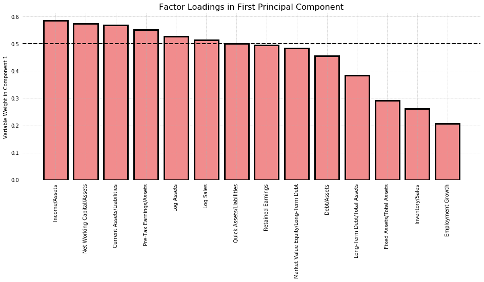
PCA is most commonly used for dimensionality reduction, but it can also be used to choose variables. We consider only the first principal component, and compare the factor loadings it assigns to each variable. This amounts to looking at the amount of variance each variable contributes in the direction of greatest variance. As seen in the graph below, most variables contribute equally, save for Fixed Assets/Total Assets, Inventory/Sales, and Employment Growth, which have a weight about half that of other variables. In the interest of choosing an arbitrary cutoff, I chose 0.5. This results in 6 variables be selected: Income/Assets, Net Working Capital/Assets, Current Assets/Liabilities, Pre-Tax Earnings/Assets, Log Assets, and Log Sales.
fig, ax = plt.subplots(figsize=(16,6))
centered = (X_train[X_vars1[1:]] - X_train[X_vars1[1:]].mean())/X_train[X_vars1[1:]].std()
w, v = np.linalg.eig(centered.cov())
comp_1 = np.apply_along_axis(np.sum, 1, np.abs(v[:, :2]))
names = centered.columns[comp_1.argsort()[::-1]].tolist()
ax.grid(ls='--', lw=0.5, zorder=1)
ax.bar(names, comp_1[comp_1.argsort()][::-1].tolist(), lw=3, zorder=1, facecolor=cm.Set1_r(8), alpha=0.5)
ax.bar(names, comp_1[comp_1.argsort()][::-1].tolist(), lw=3, zorder=2, facecolor='none', edgecolor='black')
ax.axhline(0.5, ls='--', color='black', lw=2)
jesse_tools.remove_chart_ink(ax)
ax.tick_params(axis='x',
              rotation=90)
ax.set_title('Factor Loadings in First Principal Component', fontsize=16)
ax.set_ylabel('Variable Weight in Component 1')
plt.show()
Decision Tree Alogrithm
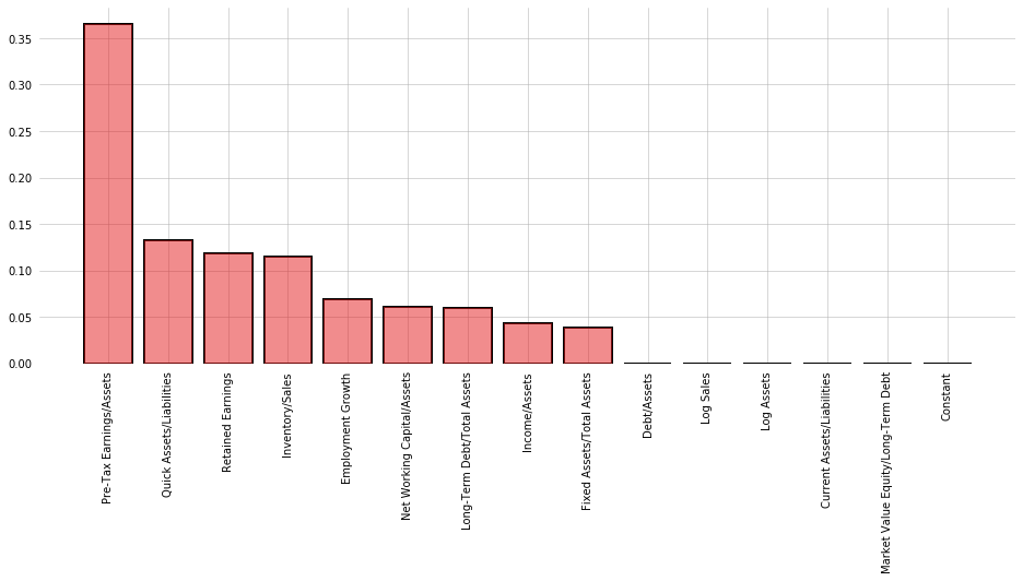
In addition to being a classification model, CART algorithms can be used to generate non-parametric measures of variable importance in classification. The algorithm considers all 14 ratios, looking to split the data into two bins along a single value. Each bin should be as "pure" as possible, with purity measured as minimization of the probability of drawing 2 members of different classes from the same bin (Gini impurity). This same operation is then repeated on the resulting bins, until all bins are completely pure.
A consequence of this dividing-and-binning approach is that the variables used to split first can be thought of as more useful. We can use the algorithm to evaluate the ability of each variable to neatly divide the sample into the positive and negative class.
The graph below shows each variable, ranked by "Gini importance", computed:
$$\text{Importance}_t = \frac{N_t}{N} \cdot \left(\text{Impurity}_t - \frac{N_{t+1,\text{Right}}}{N_t} \cdot \text{Right Child Impurity}_{t+1} - \frac{N_{t+1,\text{left}}}{N_t} \cdot \text{Left Child Impurity}_{t+1}\right)$$Where $N_t$ is the number of samples in the current bin, Impurity refers to the Gini impurity measure, and the left and right children refer to the bins that result from splitting the current bin.
A decision tree for the training dataset can be seen below. Pre-Tax Earnings is by far the most Gini Important variable, and is at the top of the decision tree. Interestingly, Quick Assets/Liabilities is ranked as the 2nd most important, but has low correlation with Default and contributes little overall variance as measured by PCA.
from sklearn.tree import DecisionTreeClassifier

tree = DecisionTreeClassifier().fit(X_train, y_train)
fig, ax = plt.subplots(figsize=(16,6))
y = tree.feature_importances_
x = X_train.columns
ax.bar(x[(-y).argsort()], y[(-y).argsort()], color=cm.Set1_r(8), alpha=0.5, zorder=3)
ax.bar(x[(-y).argsort()], y[(-y).argsort()], color='none', edgecolor='black', lw=2, zorder=2)
ax.tick_params(axis='x',
              rotation=90)
jesse_tools.remove_chart_ink(ax)
ax.grid(lw='0.5', ls='-')
plt.show()
from sklearn.tree import plot_tree
fig, ax = plt.subplots(figsize=(10,10), dpi=200)
plot_tree(tree, filled=True, class_names=['Non-Default', 'Default'], feature_names=X_train.columns, ax=ax, fontsize=5)
ax.set_title('Decision Tree Diagram')
plt.show()

Stepwise-In Algorithm
Another method for variable selection is a stepwise-in procedure. The algorithm will begin with just a constant term, then add each variable and estimate a model, one at a time. After a model is estimated, a performance metric of choice is measured in-sample (for confusion matrix measures it is measured at the maximizing threshold). The variable that shows the best score is added to the model and the process is repeated, until no variables improve the metric.
F1, accuracy, and AUC are considered as metrics. Precision and recall can always be maximized regardless of the dataset (simply choose a threshold of 0 or 1), and cannot be used in this algorithm as written.
AUC seems to mechanically increase in-sample with additional variables. Without adding some out-of-sample verification (e.g., via cross-validation), it does not produce useful results. F1 and Accuracy measures, however, both agree on an extremely parsimonious model of just 3 ratios: Pre-Tax Earnings/Assets, Employment Growth, and Net Working Capital/Assets.
def forward_stepwise(X, y, metric='auc', β=None):
    remaining = X.columns.tolist()
    if 'Constant' in remaining:
        remaining.remove('Constant')
        selected = ['Constant']
    else:
        selected = []
    current_score, best_new_score = 0., 0.
    while remaining and current_score == best_new_score:
        pct_o = int(((len(X.columns) - len(remaining)) / len(X.columns)))*100
        scores_with_candidates = []
        for i, candidate in enumerate(remaining):
            temp = selected.copy()
            temp.append(candidate)
            model = sm.Logit(y, X[temp]).fit(disp=0)

            if metric == 'auc':
                score = roc_auc_score(y, model.predict(X[temp]))
            else:
                _, score, _ = optimize_threshold(X[temp], y, model, metric=metric, β=β)
            scores_with_candidates.append((score, candidate))

        scores_with_candidates.sort()
        best_new_score, best_candidate = scores_with_candidates.pop()
        if current_score < best_new_score:
            remaining.remove(best_candidate)
            selected.append(best_candidate)
            current_score = best_new_score
        elif current_score == best_new_score:
            return selected
    return selected
import multiprocessing as mp
from sklearn.datasets import make_regression

X_f1 = forward_stepwise(X_train, y_train, metric='f', β=1)
X_accuracy = forward_stepwise(X_train, y_train, metric='accuracy')
X_auc = forward_stepwise(X_train, y_train, metric='auc')
print('X Variables selected for F1 score:', ', '.join(x for x in X_f1))
print('\n')
print('X Variables selected for Accuracy:', ', '.join(x for x in X_accuracy))
print('\n')
print('X Variables selected for AUC:', ', '.join(x for x in X_auc))
Recursive Feature Elimination
One final method of selecting variables is to begin with a full model and recursively remove those variables with the coefficients closest to 0. For the algorithm implemented in Scikit-Learn, we need to specify a desired number of variables in the final model. All other methods of selection have, so far, indicated between 3 and 5 variables, so these will be tested.
from sklearn.feature_selection import RFE
from sklearn.linear_model import LogisticRegression

logit = LogisticRegression()
X_vars_5 = RFE(logit, 5).fit(X_train[X_vars1], y_train)
X_vars_4 = RFE(logit, 4).fit(X_train[X_vars1], y_train)
X_vars_3 = RFE(logit, 3).fit(X_train[X_vars1], y_train)
print('Selected 5: ', ', '.join(np.array(X_vars1)[X_vars_5.support_]))
print('Selected 4: ', ', '.join(np.array(X_vars1)[X_vars_4.support_]))
print('Selected 3: ', ', '.join(np.array(X_vars1)[X_vars_3.support_]))
Summary
5 methods of variable selection were presented in this sub-section. The methods, and the variables selected, are repeated here for convenience.
1) Simple correlation with the class label
Income/Assets, Pre-Tax Earnings/Assets, Debt/Assets, Retained Earnings
2) Largest Factor Loadings in PCA Component 1
Income/Assets, Net Working Capital/Assets, Current Assets/Liabilities, Pre-Tax Earnings/Assets, Log Assets, and Log Sales.
3) Decision Tree Gini Importance
Pre-Tax Earnings, Quick Assets/Liabilities, Retained Earnings, Inventory/Sales, Employment Growth, Net Working Capital/Assets, Long-Term Debt/Total Assets, Fixed Assets/Total Assets, Market Value Equity/Long-Term Debt
4) Stepwise-in Selection, F1 and Accuracy Maximization
Pre-Tax Earnings/Assets, Employment Growth, Net Working Capital/Assets
5) Recursive Feature Elimination
Income/Assets, Pre-Tax Earnings/Assets, Retained Earnings, Net Working Capital/Assets, Employment Growth
Regression
The table below summarizes 7 regression models: One corresponding to each of the methods of variable selection, plus a "baseline" of all 15 variables, plus the published 5 variable model.
Among the 5 models we consider, Pre-Tax Earnings/Assets appears in all of them, but it does not appear in the published regression. Comparing Step In and the Published model,it seems one can choose either Pre-Tax or Income/Assets, but not both. The maximum correlation and PCA variable selection methods have insignificant coefficients because they include both of these, plus Debt/Assets.
Looking at the AIC, the difference between the models is very slight. The Tree model has the lowest AIC, but only by a small amount. The 80% explained variance model has the highest PCA, and Retained Earnings has a marginal effect on AIC of 1.7, which is nearly the difference between highest and lowest model.
from statsmodels.iolib.summary2 import summary_col
pca_vars = ['Constant', 'Income/Assets', 'Net Working Capital/Assets', 'Current Assets/Liabilities',
            'Pre-Tax Earnings/Assets', 'Log Assets', 'Log Sales']
tree_vars = ['Constant'] + X_train.columns[(-tree.feature_importances_).argsort()][:-7].tolist()
step_in_vars = ['Constant', 'Pre-Tax Earnings/Assets', 'Employment Growth', 'Net Working Capital/Assets']
step_out_vars = ['Constant', 'Income/Assets', 'Pre-Tax Earnings/Assets',
                 'Retained Earnings', 'Net Working Capital/Assets', 'Employment Growth']
published = ['Constant', 'Debt/Assets', 'Employment Growth', 'Income/Assets', 'Log Sales', 'Inventory/Sales']

regs = [X_vars1, X_vars1[:4], pca_vars, tree_vars, step_in_vars, step_out_vars, published]
reg_names = ['All', 'Corr', 'PCA', 'Tree', 'Step In', 'Step Out', 'Published']
info_dict = {'Psuedo R-squared': lambda x: f'{x.prsquared:.2f}',
            'No. Observations': lambda x: f'{x.nobs:d}',
            'AIC': lambda x: f'{x.aic:0.2f}'}
regressor_order = X_vars1

results = []
for reg in regs:
    X = X_train[reg]
    result = sm.Logit(y_train, X).fit(disp=0);
    results.append(result)

results_table = summary_col(results=results,
                           float_format='%0.3f',
                           stars=True,
                           model_names=reg_names,
                           info_dict=info_dict,
                           regressor_order=regressor_order)

results_table.add_title('Multivariate Logit Models of Default')
print(results_table)
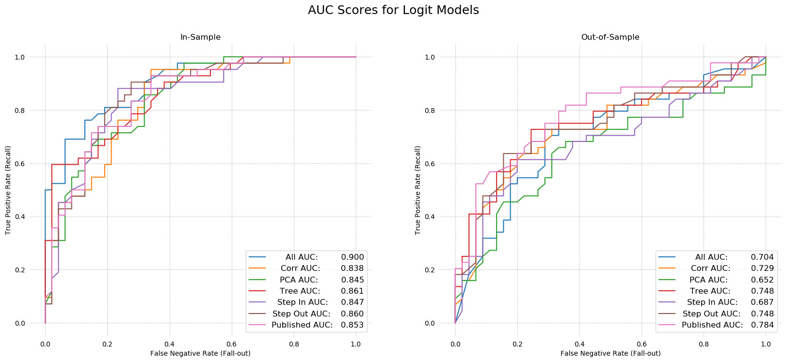
ROC AUC
Turning to the AUC scores, we knew from the step-in algorithm that the full model has the highest in-sample AUC. Testing confirms our intuition that this model was overfit. The out-of-sample AUC is very low for the 15 variable model.
The step-in and PCA models seem to be the worst. Their in-sample AUCs are among the lowest, at .847 and .845 respectively, while out-of-sample AUCs are dead last by a large margin. The published model performed the best out-of-sample (AUC .784), followed by the step-out (recursive feature elimination) algorithm's model (AUC .748). The Tree-selected and max correlation models performed reasonably well out-of-sample, with AUCs of .745 and .729, respectively.
Despite the published model being the best, in the interest of being different, I will select the Step Out Model as my preferred specification. It is more parsimonious than the published model, and has nearly the same explanatory power.
fig, ax = plt.subplots(1, 2, figsize=(20,8), dpi=100)

for X_frame, y_frame, axis in zip([X_train, X_test], [y_train, y_test], fig.axes):
    for model, X_vars, name in zip(results, regs, reg_names):
        tpr = []
        fpr = []
        for threshold in np.linspace(0,1,200):
            y_hat = [1 if x > threshold else 0 for x in model.predict(X_frame[X_vars])]
            TP, FP, FN, TN = jesse_tools.score_classifier(y_frame, y_hat)
            tpr.append(TP/(TP + FN))
            fpr.append(FP/(FP + TN))
            score = roc_auc_score(y_frame, model.predict(X_frame[X_vars]))
        label = f'{name} AUC:'
        label += ' '*(17 - len(label))
        label += f'{score:0.3f}'
        axis.plot(fpr, tpr, label=label)
        axis.grid(ls='--', lw=0.5)
    legend = axis.legend(loc='lower right', fontsize=12)
    plt.gcf().canvas.draw()
    shift = max([t.get_window_extent().width for t in legend.get_texts()])
    for t in legend.get_texts():
        t.set_ha('right') # ha is alias for horizontalalignment
        t.set_position((shift,0))
    jesse_tools.remove_chart_ink(axis)
    if X_frame is X_train: name = 'In-Sample'
    else: name = 'Out-of-Sample'
    axis.set_title(name)
    axis.set_xlabel('False Negative Rate (Fall-out)')
    axis.set_ylabel('True Positive Rate (Recall)')

fig.suptitle('AUC Scores for Logit Models', fontsize=18)
plt.show()
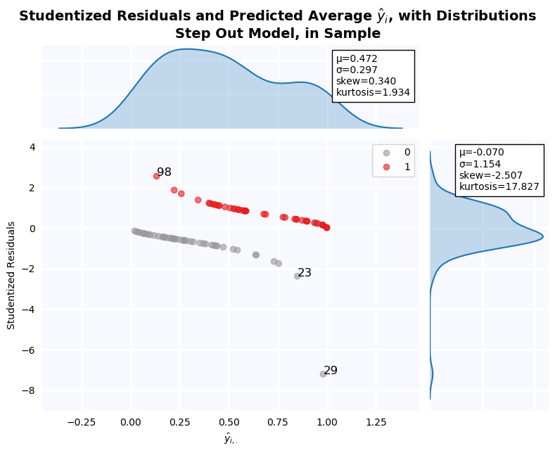
Studentized Residuals for the Step-Out Model
Studentized residuals are shown on the y-axis KDE plot. There is a massive outlier in the negative class: Firm 29. As a result, residuals are clearly non-normal. Below, all outlier firms identified on the residuals graph are dropped, and tests of normalcy are performed. Residuals are still non-normal in both cases.
jesse_tools.resid_plot(X_train[step_out_vars],
                       model=None,
                       y = y_train,
                       resids=None,
                       y_hat=results[5].predict(X_train[step_out_vars]),
                       outlier_y = [-1.96, 1.96],
                       labels_y=True,
                       title='Step Out Model, in Sample', color_col=y_train, cmap='Set1_r')
y_hat = results[5].predict(X_train[step_out_vars].drop(index=[29,23,98]))
resids = y_train.drop(index=[29,23,98]) - y_hat
student_resid = resids / np.sqrt(y_hat * (1 - y_hat))
print('Jarque-Bera Test of Normalcy')
print('H0: Normal Distribution')
print(f'Test Statistic: {stats.jarque_bera(student_resid)[0]:0.3f}')
print(f'P-value:        {stats.jarque_bera(student_resid)[1]:0.3f}')
print('Kolmogorov–Smirnov Test of Distributional Equivilance')
print('H0: Normal Distribution')
print(f'Test Statistic: {stats.kstest(student_resid, "norm")[0]:0.3f}')
print(f'P-value:        {stats.kstest(student_resid, "norm")[1]:0.3f}')
Relative Weight of Type 1 and Type 2 Errors for a Private Banker
A lot of ink has been spilled asking how machine learning can be brought into economics. Much less commonly asked is what economics can contribute to machine learning. This question points to one such instance. Two possible approaches to this question are considered: use of the F-beta metric, and use of iso-cost curves.
F-$\beta$ Score
A popular metric used to balance type 1 and type 2 errors is the F-beta metric [1], defined:
$$\text{F}_\beta = (1+\beta)^2 \cdot \frac{\text{Precision}\cdot\text{Recall}}{\beta\cdot\text{Precision}+\text{Recall}}$$With:
$$\text{Precision} = \frac{\text{True Positive}}{\text{True Positive} + \text{False Positive}}$$$$\text{Recall} = \frac{\text{True Positive}}{\text{True Positive} + \text{False Negative}}$$So we can rewrite F-beta in terms of Type 1 and Type 2 errors:
$$\text{F}_\beta = \frac{(1 + \beta)^2 \cdot \text{True Positive}}{(1+\beta)^2 \cdot \text{True Positive} + \beta^2 \cdot \text{False Negative} + \text{False Positive}}$$The precision/recall formulation is preferred, however, because it makes it clear $\beta$ represents an agent's preferences between minimization of false positives and false negatives. Specifically, an agent cares $\beta$ times more about recall (minimization of false negatives) than precision (minimization of false positives). This creates an microeconomic question: how can agent preferences be modeled with respect to these two goals?
In our case, a "positive" means predicting a firm is NOT solvent, while "negative" means predicting the bank is financially HEALTHY.
In principal, a banker would know the opportunity cost of failing to make a loan on advantageous terms to a firm in financial difficulties (the result of a false positive) and the downside risk of writing a loan that will default (the result of a false negative).
A numerical example can show how $\beta$ is computed in this situation. We consider a simple 2-period model. At t=1, a bank has the opportunity to write a loan of 100$ to a financially distressed firm. The bank can charge a premium on the loan, because other banks are unwilling to write the loan. At t=2, the firm either pays back the entire loan plus interest, or defaults, in which case the bank receives the recovery rate.
Suppose the recovery rate is 50\%, and the bank can charge 10\% interest on the loan, compared to 5\% to an unambiguously healthy firm. Further suppose the bank has other potential clients, at least some of whom are less likely to default than this firm (but will command a lower interest rate as a result). Thus, the cost of passing is -5, and the cost of default is -50.
False positive (don't loan to a healthy company) = -5
False negative (loan to an unhealthy company) = -50
The cost of a false negative is 10-times higher than the cost of a false positive. The banker, therefore, is 10-times more interested in minimizing false negatives (recall) than minimizing false positives, and we can set $\beta = 10$
Given the way the payoffs are structured, the banker is always more interested in minimizing false negatives. What all this means in terms of AUC is that points towards the TOP of the curve are preferred to points towards the bottom of the curve. To see this, first recognize that the fall-out rate, defined:
$$ \text{FPR} = \frac{\text{False Positive}}{\text{False Positive} + \text{True Negatives}} $$Is equal to one minus precision. Thus we can recover the extent to which the model minimizes false positives by taking 1-FPR. For points towards the bottom of the curve (where both fall-out and recall are low), the corresponding precision is high, meaning the model does a good job avoiding false positives. The inverse is true towards the top; the model avoids false negatives as the expense of false positives.
This means that given two models with exactly the same AUC but different shapes, we should prefer the model with a "bulge" towards the top of the graph rather than towards the bottom. To make this more evident, a Precision-Recall Curve can be used rather than an AUC curve. This is graphed in question 19.
Iso-Cost Curves
Another economic approach to selection of threshold $s$ comes from the Moody's article we saw in class. A linear loss function, associating a cost with false positives and false negatives, can be defined:
$$\mathcal{L} = C_{\text{FP}} \cdot \text{FP} + C_{\text{FN}} \cdot \text{FN}$$Continuing the numerical example above, we can choose $C_{\text{FP}} = -5$ and $C_{\text{FN}} = -50$. Rearranging terms to put the function into False Positive-False Negative space, we obtain:
$$ \text{FP} = \frac{\mathcal{L}}{C_{\text{FP}}} - \frac{C_{\text{FN}}}{C_{\text{FP}}}\cdot \text{FN}$$By finding a point of tangency between the curve formed by the number of false negatives and the number of false positives for all values of $s$ for a given classifier, a threshold can be found which minimizes this loss function. Such a point of tangency is found below. The threshold of tangency is 0.22, and has an associated loss of -175. In contrast, the F-10 threshold (identified below as s=.131) has a loss of -180, which is similar but slightly worse.
def interpolated_intercepts(x, y1, y2):
    """Find the intercepts of two curves, given by the same x data, via linear interpolation. Can identify points which are
    not in the actual datasets, allowing for greater precision.

    Written by DanHickstein
    https://stackoverflow.com/questions/42464334/find-the-intersection-of-two-curves-given-by-x-y-data-with-high-precision-in"""

    def intercept(point1, point2, point3, point4):
        """find the intersection between two lines
        the first line is defined by the line between point1 and point2
        the first line is defined by the line between point3 and point4
        each point is an (x,y) tuple.

        So, for example, you can find the intersection between
        intercept((0,0), (1,1), (0,1), (1,0)) = (0.5, 0.5)

        Returns: the intercept, in (x,y) format
        """

        def line(p1, p2):
            A = (p1[1] - p2[1])
            B = (p2[0] - p1[0])
            C = (p1[0]*p2[1] - p2[0]*p1[1])
            return A, B, -C

        def intersection(L1, L2):
            D  = L1[0] * L2[1] - L1[1] * L2[0] + 1e-20
            Dx = L1[2] * L2[1] - L1[1] * L2[2] + 1e-20
            Dy = L1[0] * L2[2] - L1[2] * L2[0] + 1e-20

            x = Dx / D
            y = Dy / D

            return x,y

        L1 = line([point1[0],point1[1]], [point2[0],point2[1]])
        L2 = line([point3[0],point3[1]], [point4[0],point4[1]])

        R = intersection(L1, L2)

        return R

    idxs = np.argwhere(np.diff(np.sign(y1 - y2)) != 0)

    xcs = []
    ycs = []

    for idx in idxs:
        xc, yc = intercept((x[idx], y1[idx]),((x[idx+1], y1[idx+1])), ((x[idx], y2[idx])), ((x[idx+1], y2[idx+1])))
        xcs.append(xc)
        ycs.append(yc)
    return np.array(xcs), np.array(ycs)

fig, ax = plt.subplots(figsize=(8,6), dpi=100)
FNs = np.zeros(100)
FPs = np.zeros(100)

# Find the number of False Positives and False Negatives associated with the model
thresholds = np.linspace(0, 1, 100)
for i, s in enumerate(thresholds):
    TP, FP, FN, TN = jesse_tools.score_classifier(y_train,
                                                  [1 if x > s else 0 for x in results[5].predict(X_train[step_out_vars])])
    FNs[i] = FN
    FPs[i] = FP

# We cannot do linear interpolation if a single value of FN maps to several values of FP, so we add a tiny regulatization
# term to ensure all pairs of (FN, FP) are unique
for i in range(1, len(FPs)-1):
    if FPs[i] == FPs[i-1]:
        FPs[i:] += 1e-3
    if FNs[i] == FNs[i-1]:
        FNs[i:] += 1e-3

#Define the loss function
def loss_function(FN, FP_1, FN_1, L=None, c_fp = -5, c_fn = -50):
    if L is not None:
        return L / c_fp - (c_fn/c_fp) * FN
    else:
        return -(c_fn/c_fp) * (FN - FN_1) + FP_1
#Append values -10 to -1 to FN to plot the iso-cost curve up beyond the graph (more beautiful)
exes = list(range(-10, 0))
exes += list(FNs)


# Find tangent line to the curve by looking for the loss curve which both intersects the trade-off curve and
# is always below it.

for FP, FN in zip(FPs, FNs):
    loss = np.array([loss_function(n, FP, FN) for n in exes])
    if all((FPs - loss[10:]) >= 0):
        idx = FPs.tolist().index(FP)
        break

# Compute loss function at the point of tangency
TP, FP_o, FN_o, TN = jesse_tools.score_classifier(y_train,
                                              [1 if x > thresholds[idx] else 0 for x in results[5]\
                                               .predict(X_train[step_out_vars])])

L = -5 * FP_o - 50 * FN_o

#Finally plot everything
ax.plot(FNs, FPs, label='False Positive/False Negative Trade-off Curve', color=cm.Set1_r(8), lw=2)
ax.plot(exes, loss, label='Iso-Cost Curve, $\mathcal{L}=$' + f'{L:0.2f}', color=cm.Set1_r(0), lw=2, ls='--')

xcs, ycs = interpolated_intercepts(FNs, FPs, loss[10:])
plt.plot(xcs[0], ycs[0], marker='o', color='black', ms=5, label=f'Threshold of Tangency, s={thresholds[idx]:0.2f}')

ax.set_ylim([0, 50])
ax.set_xlim([-1, 45])

jesse_tools.remove_chart_ink(ax)
ax.set_xlabel('Number of False Negatives')
ax.set_ylabel('Number of False Positives')
title = 'False Negatives and False Positives for Thresholds of Step-Out Function'
equation = '$\mathcal{L} = C_{FP} \cdot FP + C_{FN} \cdot FN$'
ax.set_title(title + '\n' + 'With Iso-Cost Curve ' + equation)
ax.grid(ls='--', lw=0.5)
ax.legend()
plt.show()
In- and Out-of-Sample Metrics for the Step-Out Model
We will continue to use the numerical example above, wherein a false negative costs the agent 10x more than a false positive. There are two thresholds to consider. First, the optimum F-10 beta, and then the minimum iso-cost threshold s=0.22. Finally, ROC curves and a Precision-Recall Curves are plotted for in- and out-of-sample predictions, and show the selected thresholds.
Confusion Matrices
When optimized for maximum f-10 value, the model makes no type 2 errors in sample. Accuracy is still above prevalence, meaning in terms of overall classification, the model does better than always guessing the majority class. The cost of making no type 2 errors, however, is an extremely high type 1 error rate. This model "leaves money of the table", so to speak, by not loaning to worthy companies out of fear of losses. In addition, when this calibrated threshold is used on the out-of-sample data, the advantage several type 2 errors are made. This is disappointing, because we might like a model with saves an analyst time by "filtering out" all the clearly healthy firms, leaving him to examine the remainder (in the in sample case, his workload is reduced by 13%). Out of sample, however, negative classification are not fully trustworthy. It will be necessary to look carefully at firms marked healthy, to ensure no costly type 2 errors are made, making the model next to useless.
f_in_threshold, f_in_score, f_in_predictions = optimize_threshold(X_train[step_out_vars], y_train, results[5], metric='f', β=10)
f_out_predictions = [1 if x > f_in_threshold else 0 for x in results[5].predict(X_test[step_out_vars])]
f_out_score = fbeta_score(y_test, f_out_predictions, 10)

jesse_tools.confusion_matrix_two(title='In- and Out-of-Sample Confusion Matricies, Step-Out Model, F-10 Maximized',
                                scores_1 = jesse_tools.score_classifier(y_train, f_in_predictions),
                                scores_2 = jesse_tools.score_classifier(y_test, f_out_predictions),
                                subtitle1=f'In Sample, s = {f_in_threshold:0.3f}',
                                subtitle2=f'Out-of-Sample, s = {f_in_threshold:0.3f}')
print('\n')
print(f'In-sample f-10 score: {f_in_score:0.3f}')
print(f'Out-of-sample f-10 score: {f_out_score:0.3f}')
Turning to the iso-cost minimized threshold of 0.22, the overall accuracy and F1 score both in- and out-of-sample has gone up, with only a very small cost in recall (0.3 in-sample and 0.2 out-of-sample). At the cost of a single costly false positive, 11 additional firms are correctly identified as true negatives, making the positive classification significantly more trustworthy. Out of sample, the trade was 1 false negative for 5 additional true negatives. It is clear that this is a superior choice of threshold than the F-10 beta threshold, which is too low to be useful.
f_in_predictions = [1 if x > 0.22 else 0 for x in results[5].predict(X_train[step_out_vars])]
f_out_predictions = [1 if x > 0.22 else 0 for x in results[5].predict(X_test[step_out_vars])]

jesse_tools.confusion_matrix_two(title='In- and Out-of-Sample Confusion Matricies, Step-Out Model, Iso-Cost Minimized',
                                scores_1 = jesse_tools.score_classifier(y_train, f_in_predictions),
                                scores_2 = jesse_tools.score_classifier(y_test, f_out_predictions),
                                subtitle1=f'In Sample, s = 0.22',
                                subtitle2=f'Out-of-Sample, s = 0.22')
AUC Curve
AUC curves from question 17 are repeated here for convenience. In addition, the threshold that generates the maximum f-10 score is marked on the plot. It is very high towards the (1,1) corner of the plot, in accordance with the objective of maximizing recall (minimizing type 2 errors).
fig, ax = plt.subplots(1, 2, figsize=(15,5), dpi=100)
f10_threshold = 0.131
iso_threshold = 0.22
for axis, X, y in zip(fig.axes, [X_train, X_test], [y_train, y_test]):
    recalls = []
    fallouts = []
    for s in np.linspace(0, 1, 129):
        pred = [1 if x > s else 0 for x in results[5].predict(X[step_out_vars])]
        TP, FP, FN, TN = jesse_tools.score_classifier(y, pred)
        recall = TP / (TP + FN )
        fallout = FP / (FP + TN)
        recalls.append(recall)
        fallouts.append(fallout)
        for threshold, color, label in zip([f10_threshold, iso_threshold], ['black', cm.Set1_r(0)], ['F-10 Threshold', 'Iso-Cost Threshold']):
            if np.abs(s - threshold) < 0.005:
                t_x = fallout
                t_y = recall
                axis.scatter(t_x, t_y, color=color, zorder=2, label=label)
    score = roc_auc_score(y, results[5].predict(X[step_out_vars]))
    axis.plot(fallouts, recalls, color=cm.Set1_r(8), label = f'AUC: {score:0.3f}', zorder=1)
    jesse_tools.remove_chart_ink(axis)
    axis.grid(ls='--', lw=0.5)
    if X is X_train: axis.set_title('In-Sample')
    else: axis.set_title('Out-of-Sample')
    axis.set_xlabel('False Positive Rate (Fall-out)')
    axis.set_ylabel('True Positive Rate (Recall)')
    axis.legend(loc='lower right', fontsize=12)

fig.suptitle('In- and Out-of-Sample AUC Curves for Step-Out Model', fontsize=16)
plt.show()
Precision-Recall Curve
Plotting a Precision-Recall curve makes the trade off between type 2 error minimization and type 1 error minimization very clear. The curve increases rapidly in precision for a very low lost in recall, but because we have rated a type 2 error as 10 times more expensive than a type 1 error, it is still insufficient compensation to move away from recall=1.0. The iso-cost threshold, on the other hand, does allow a small sacrifice of recall in exchange for some precision. The relative "stickiness" of the F-10 threshold is really visible on the out-of-sample plot. Here, the decrease in recall to move from the F-10 point to the iso-cost point is not perceivable (checking the confusion matrices above, it decreases by 0.0228), and despite standing to gain nearly 0.5 precision, the F-10 doesn't accept it.
from sklearn.metrics import precision_recall_curve

fig, ax = plt.subplots(1, 2, figsize=(15,5), dpi=100)
for axis, X, y in zip(fig.axes, [X_train, X_test], [y_train, y_test]):
    gx, gy, s = precision_recall_curve(y, results[5].predict(X[step_out_vars]))
    axis.plot(gx,gy, color=cm.Set1_r(8), zorder=1)
    for threshold, color, label in zip([f10_threshold, iso_threshold], ['black', cm.Set1_r(0)], ['F-10 Threshold', 'Iso-Cost Threshold']):
        idx = np.argsort(np.abs(s - threshold))[0]
        t_x = gx[idx]
        t_y = gy[idx]
        axis.scatter(t_x, t_y, color=color, zorder=2, label=label)
    jesse_tools.remove_chart_ink(axis)
    axis.set_xlabel('Precision')
    axis.set_ylabel('Recall')
    axis.grid(ls='--', lw='0.5')
    if X is X_train: axis.set_title('In-Sample')
    else: axis.set_title('Out-of-Sample')
    axis.legend()
fig.suptitle('Precision-Recall Curves, Step-Out Model, In- and Out-of-Sample', fontsize=16)
plt.show()
What Weight Would I Give This Model as a Credit Analyst
Models highly tuned for either precision or recall can be quite helpful to an analyst as a sorting mechanism. If faced with analyzing the 89 in the test set, the model immediately cuts down on the workload. We can be quite confident that any firm given a negative score by this model is a totally safe firm, and can be fast-tracked for loans. This is nice, but breaks down out-of-sample. As noted above, the negative classifications are only good 66% of the time, which means the analyst cannot even count on these to save her time. As a result, the model is useless. With the remaining positive classifications, the model is no better than a coin toss, and all the firms need to be analyzed on a case by case basis. The model should not be given much weight in the case of a positive classification.
Obviously $\beta=10$ extremely punishes false negatives and leads to this result. The other way of tuning the threshold, using an iso-cost curve, also punished false negatives, but led to a slightly less strict model. Here, accuracy was overall higher, and a more economic trade-off between false negatives and false-positives was found. The model was more trustworthy in positive classifications (~2/3 correctly classified) at only a small false negative cost. Overall, it is a much superior model.
Additional Work
I turn next to a wide variety of machine learning methods, because why not. We will consider:
- Regularized Linear Probability Model
- Regularized Logistic Regression
- K-Nearest Neighbors Classification
- Support Vector Machines
- Decision Trees
- Random Forest Classification
- Gradient Boosted Decision Trees
- Feed-Forward Neural Network
Many of these methods are quite silly. Running a neural network on such a small dataset, for example, is like killing a fly with a machine gun. But I'll implement it just for the demonstration. First, though, I want to get back the data points that we dropped. We have so little data, so we need everything we can get. We will do this via K-Nearest Neighbor interpolation of the -99.99 values.
#Reload the data to interpolate missing values
df = pd.read_csv('C:/Users/Jesse/Data/defaut2000.csv', sep=';')
df.rename(columns=variables, inplace=True)

#Split into two dataframes, one with labels and one with explainatory variables
y = df['Financial Difficulty'].copy()
X = df.iloc[:, 1:].copy()

#Data has French-language numbers; these are read as strings in Python. Replace commas
#with periods then convert to float.
X = X.applymap(lambda x: x.replace(',', '.')).applymap(np.float32)
X['Constant'] = 1

importance = {}
outliers = {}
auc = {}
#Split data into missing and not missing, drop variables with
no_missing = X[~((X['Fixed Assets/Total Assets'] < 0) | (X['Long-Term Debt/Total Assets'] < 0))].copy()
no_missing.drop(columns=['Fixed Assets/Total Assets', 'Long-Term Debt/Total Assets'], inplace=True)
missing = X[((X['Fixed Assets/Total Assets'] < 0) | (X['Long-Term Debt/Total Assets'] < 0))].copy()
missing.drop(columns=['Fixed Assets/Total Assets', 'Long-Term Debt/Total Assets'], inplace=True)
Interpolation of Missing Data
Instead of just dropping the observations with Fixed Assets/Total Assets or Long-Term Debt/Total Assets equal to -99, we can fill these in with the mean of several similar firms. To do this, a K-Nearest Neighbors algorithm will be used. KNN simply computes the Euclidian distance matrix and returns the K observations with the shortest distance from a given observation. We will exclude the variable being interpolated, as well as the observations with missing values. To determine how many neighbors to use, we will look at an arbitrarily large number of neighbors and check at what point neighbors become increasingly dissimilar.
Firm 1 seems to be a bit of an outlier from the rest of the dataset. Firms 18 and 78 seem to be in a large cluster, and distance to the next neighbor slowly and gradually increases. Firm 1, on the other hand, is very far from the nearest neighbor and only grows further from there.
from sklearn.neighbors import NearestNeighbors
nn = NearestNeighbors(n_neighbors=25, algorithm='ball_tree', n_jobs=-1).fit(no_missing)

distance, indexes = nn.kneighbors(missing)
fig, ax = plt.subplots(figsize=(8,6), dpi=100)

y1,y2,y3 = distance.squeeze()
x = np.arange(25)
for yy, label in zip([y1, y2, y3], missing.index):
    plt.plot(x, yy, label = f'Firm {label}')
ax.legend()
jesse_tools.remove_chart_ink(ax)
ax.grid(lw=0.5, ls='--')
ax.set_title('Euclidian Distance to Nth Closest Neighbor')
plt.show()
One way to visualize high-dimensional data in 2D space is known as t-distributed Stochastic Neighbor Embedding (tSNE) [2]. An implementation of tSNE is shown below, with firms 1, 18, and 78 colored. We can see that firms 18 and 78 are inside the main mass of points, while firm 1 is relatively isolated, with only a single close neighbor. This is consistent with what we see in the distance graph above.
As a result, we will fill the missing value for firm 1 using only the single closet neighbor, and use an average of the 3 closest firms for firms 18 and 78 (note the spike in distance after the 3rd neighbor for firm 78; eyeballing the tSNE plot, there seem to be 3 relatively equidistant neighbors to each of these points).
from sklearn.manifold import TSNE

fig, ax = plt.subplots(figsize=(8, 6), dpi=100)
tsne = TSNE(perplexity=70, random_state=0)\
                .fit_transform(X.drop(columns=['Fixed Assets/Total Assets', 'Long-Term Debt/Total Assets']))

tsne = pd.DataFrame(tsne, index=X.index, columns=['x', 'y'])

xx = tsne.x
yy = tsne.y

ax.scatter(xx, yy, color=cm.Set1_r(0))
ax.scatter(tsne.iloc[1,0], tsne.iloc[1,1], color='blue', label='Firm 1')
ax.scatter(tsne.iloc[18, 0], tsne.iloc[18,1], color='orange', label='Firm 18')
ax.scatter(tsne.iloc[78, 0], tsne.iloc[78,1], color='green', label='Firm 78')
ax.grid(lw=0.5, ls='--')
jesse_tools.remove_chart_ink(ax)
ax.set_title('tSNE Plot, All Points, Fixed Assets/Total Assets and Long-Term Debt/Total Assets Excluded\nPerplexity = 70')
ax.legend()

plt.show()
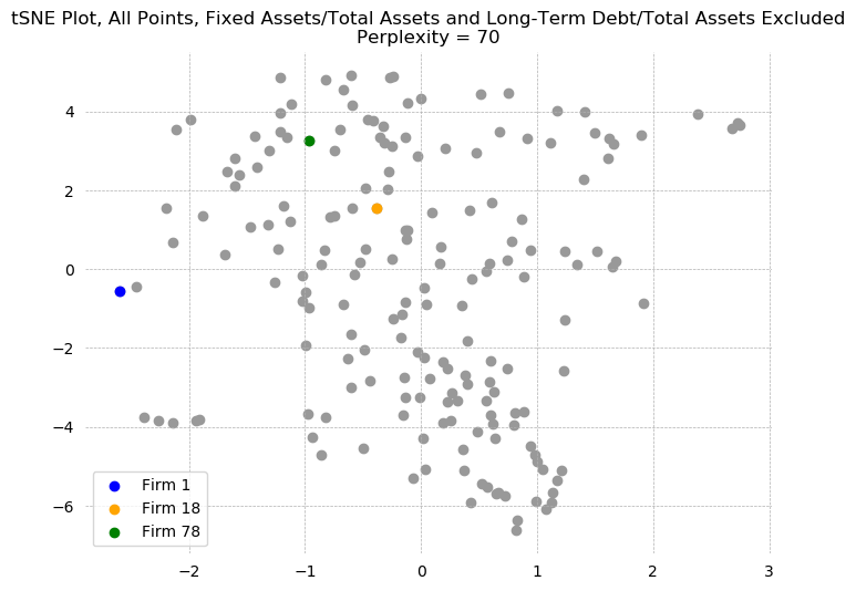
for i, (firm, n) in enumerate(zip([1, 18, 78], [1, 3, 3])):
    print(f'{n} Nearest Neighbors of Firm {firm}: {indexes[i][:n]}')
X.loc[1, 'Fixed Assets/Total Assets'] = X.loc[7, 'Fixed Assets/Total Assets']
X.loc[18, 'Long-Term Debt/Total Assets'] = X.loc[[108, 64, 70], 'Long-Term Debt/Total Assets'].mean()
X.loc[78, 'Fixed Assets/Total Assets'] = X.loc[[148, 84, 132], 'Fixed Assets/Total Assets'].mean()
X_train, X_test = X.sort_values(by='Debt/Assets').iloc[::2, :], X.sort_values(by='Debt/Assets').iloc[1::2, :]
y_train, y_test = y.iloc[X.sort_values(by='Debt/Assets').index].iloc[::2],\
                  y.iloc[X.sort_values(by='Debt/Assets').index].iloc[1::2]
print('Matrix Shapes:')
print(f'X_train: {X_train.shape}')
print(f'X_test: {X_test.shape}')
print(f'y_train: {y_train.shape}')
print(f'y_test: {y_test.shape}')
Linear Probability Model with Regularization
The first machine learning to test is simple linear regression with regularization. Regularization is a modification to the OLS objective function:
$$ \min_\beta \,\,\, \frac{1}{2}(y - X\beta)^T(y - X\beta) + \alpha \cdot ||\beta||_k^k $$The first term is the usual OLS objective function, but we add a penalty term associated with the length of the weights vector. K is chosen to be 1 or 2, with k=1 known as Lasso Regression [3] k=2 known a Ridge Regression [4]. A final specification, known as Elastic Net [5] combines both penalties:
$$ \min_\beta \,\,\, \frac{1}{2}(y - X\beta)^T(y - X\beta) + \alpha_1 \cdot ||\beta||_1^1 + \alpha_2 \cdot ||\beta||_2^2$$The advantage of regularization is that it punishes the beta values on variables that do not do a good job of contributing to the minimization of the mean squared error. In principle, this reduces overfitting by reducing the predictive influence of variables that do not contribute meaningful variance. This acts as a form of variable selection. Ridge regression is a uniform penalty, and tends to maintain all variables. Lasso, on the other hand, results in sparse solutions, and sets the coefficients of all but the most explanatory variables to zero.
$\alpha$ is a free hyper-parameter, controlling how much weight we want to put on this punishment term. We will test many values of $\alpha$ and look for the one that minimizes MSE. Values between 0.001 and 10 are considered, and the alpha that produces the highest in-sample AUC score is selected.
All available ratios will be included in the regression, and we will allow the algorithm to select among them via the penalty term. Results are presented in a table below. Both regressions were maximized at a relatively low penalty term, 0.9092 for Ridge, and 0.0010 for Lasso, and 0.0111 for the Elastic Net. The effect of the regularization term can be seen clearly on the coefficients. The Ridge Model gives a higher weight to Debt/Assets than the baseline LPM, while the Lasso model cuts it all together. The same is true for Income/Assets, Log Sales and Log Assets (though Lasso does not cut these, but reduces their magnitudes by half), and Fixed/Assets to Total Assets.
As expected, the LPM with all variables is extremely overfit, with out-of-sample AUC dropping by .17. The regularized models are much more balanced, especially Lasso and Elastic Net, but remain overfit in general. None of the models has a better out-of-sample AUC than the published model (.784).
from sklearn.linear_model import RidgeClassifier, Lasso, LinearRegression, ElasticNet
from sklearn.model_selection import GridSearchCV

lpm = LinearRegression().fit(X_train, y_train)
lpm_ridge = RidgeClassifier(max_iter=5000)
lpm_lasso = Lasso(max_iter=5000)
lpm_elnet = ElasticNet(max_iter=5000)

# The GridSearchCV function takes lists of parameters and fits models to every combination of parameters, checking the
# provided scoring metric (AUC in this case), then returning the best model. As you can probably guess, this can end up
# taking quite a long time, especially when there are several hyperparameters to tune. As a result, I've run the GridSearch
# one, saved the optimal hyperparameters, then directly fit the models using these. The code used to run the GridSearch is
# saved in case you really want to try, though.

# ridge: {'alpha': 0.9091818181818182}
# lasso: {'alpha': 0.001}
# elastic net:{'alpha': 0.011090909090909092, 'l1_ratio': 0.015}

# gs_ridge = GridSearchCV(lpm_ridge, {'alpha':np.linspace(0.001,1,100)}, scoring='roc_auc').fit(X_train, y_train)
# gs_lasso = GridSearchCV(lpm_lasso, {'alpha':np.linspace(0.001,1,100)}, scoring='roc_auc').fit(X_train, y_train)
# gs_elnet = GridSearchCV(lpm_elnet, {'alpha':np.linspace(0.001,1,100), 'l1_ratio':np.linspace(0.015, 1, 100)},
#                         scoring='roc_auc').fit(X_train, y_train)

gs_ridge = RidgeClassifier(max_iter=5000, alpha = 0.91).fit(X_train, y_train)
gs_lasso = Lasso(max_iter=5000, alpha = 0.001).fit(X_train, y_train)
gs_elnet = ElasticNet(max_iter=5000, alpha = 0.0111, l1_ratio = 0.015).fit(X_train, y_train)

titles = list(X_train.columns)
titles.append('alpha')
titles.append('In-Sample AUC')
titles.append('Out-of-Sample AUC')

lpm_coefs = list(lpm.coef_)
lpm_coefs.append(0)
lpm_coefs.append(roc_auc_score(y_train, lpm.predict(X_train)))
lpm_coefs.append(roc_auc_score(y_test, lpm.predict(X_test)))

ridge_coefs = list(gs_ridge.coef_.squeeze())
ridge_coefs.append(gs_ridge.alpha)
ridge_coefs.append(roc_auc_score(y_train, gs_ridge.predict(X_train)))
ridge_coefs.append(roc_auc_score(y_test, gs_ridge.predict(X_test)))

lasso_coefs = list(gs_lasso.coef_.squeeze())
lasso_coefs.append(gs_lasso.alpha)
lasso_coefs.append(roc_auc_score(y_train, gs_lasso.predict(X_train)))
lasso_coefs.append(roc_auc_score(y_test, gs_lasso.predict(X_test)))

elnet_coefs = list(gs_elnet.coef_.squeeze())
elnet_coefs.append(gs_elnet.alpha)
elnet_coefs.append(roc_auc_score(y_train, gs_elnet.predict(X_train)))
elnet_coefs.append(roc_auc_score(y_test, gs_elnet.predict(X_test)))
print('Variable',' '*31, 'LPM', ' '*11, 'Ridge', ' '*10, 'Lasso', ' '*10, 'E. Net')
print('='*98)
for var, val1, val2, val3, val4 in zip(titles, lpm_coefs, ridge_coefs, lasso_coefs, elnet_coefs):
    if var == 'alpha': print('='*98)
    if '-' in str(val1): line = f'{var:39s}'
    else: line = f'{var:40s}'
    line += f'{val1:0.4f}'
    if '-' in str(val2): line += ' '*10
    else: line += ' '*11
    line += f'{val2:0.4f}'
    if '-' in str(val3): line += ' '*10
    else: line += ' '*11
    line += f'{val3:0.4f}'
    if '-' in str(val4): line += ' '*10
    else: line += ' '*11
    line += f'{val4:0.4f}'
    print(line)
y_hat = gs_elnet.predict(X_train)
resid = y_train - y_hat

outliers['ridge_lpm'] = find_outliers(y_train, gs_ridge.decision_function(X_train), X=X_train, mode='linear')
outliers['lasso_lpm'] = find_outliers(y_train, gs_lasso.predict(X_train), X=X_train, mode='linear')
outliers['elnet_lpm'] = find_outliers(y_train, gs_elnet.predict(X_train), X=X_train, mode='linear')

importance['ridge_lpm'] = make_ranking(X_train, gs_ridge.coef_.squeeze())
importance['lasso_lpm'] = make_ranking(X_train, gs_lasso.coef_.squeeze())
importance['elnet_lpm'] = make_ranking(X_train, gs_elnet.coef_.squeeze())

auc['ridge_lpm'] = roc_auc_score(y_test, gs_ridge.predict(X_test))
auc['lasso_lpm'] = roc_auc_score(y_test, gs_lasso.predict(X_test))
auc['elnet_lpm'] = roc_auc_score(y_test, gs_elnet.predict(X_test))


jesse_tools.resid_plot(X_train,
                       model=gs_elnet,
                       resids=resid,
                       y_hat=gs_elnet.predict(X_train),
                       outlier_y = [-1.96, 1.96],
                       labels_y=True,
                       title='Elastic Net Linear Probability Model, in Sample', color_col=y_train, cmap='Set1_r')
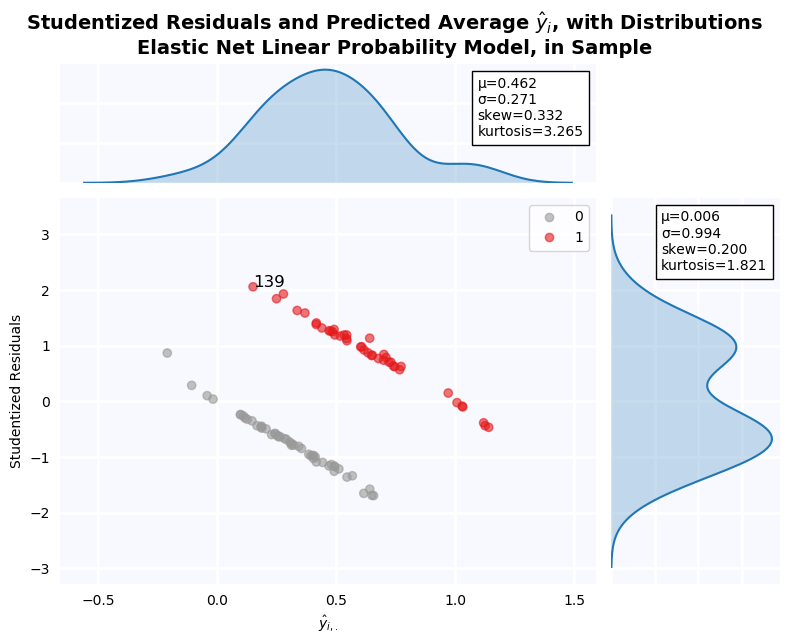
fig, ax = plt.subplots(2, 2, figsize=(24, 12), dpi=100)

for axis, model, title in zip(fig.axes, [lpm, gs_ridge, gs_lasso, gs_elnet],
                        ['LPM', 'Ridge', 'Lasso', 'Elastic Net']):
    plot_class_regions_for_classifier(model.fit(X_train[['Debt/Assets', 'Income/Assets']], y_train),
                                      X_train[['Debt/Assets', 'Income/Assets']], y_train,
                                      X_test = X_test[['Debt/Assets', 'Income/Assets']],
                                      y_test = y_test,
                                      title=title,
                                      target_names=['Non-Default', 'Default'],
                                      threshold=True, ax = axis)
fig.tight_layout()
fig.suptitle('Bivariate Linear Probability Models with Regularization', fontsize=24, y=1.03)
plt.show()
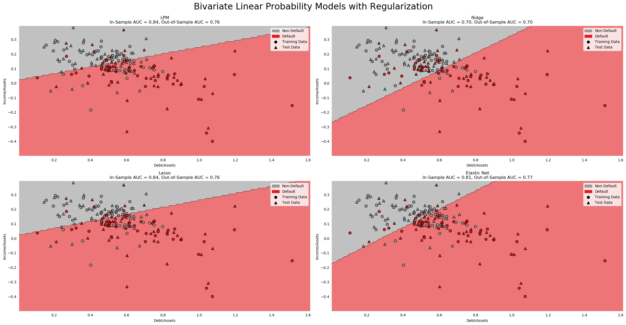
Regularized Logit Regression
The regularization framework presented above can be combined with an activation function to constrain output to the interval $[0,1]$, producing a regularized Logistic Model. The same three penalty schemes, Lasso (or L1), Ridge (or L2), and Elastic Net, can be estimated. Results are shown in a table below.
First, note that the regularization parameter is now C, not $\alpha$. C, for "cost", is defined as $\frac{1}{\alpha}$, is meant to give a more intuitive meaning to the regularization term. I don't know why one set of functions uses alpha and one set of functions uses 1/alpha, but it is important to note that a higher C implies a harsher penalty, while a lower alpha implies a higher penalty.
Because the magnitude of the coefficients on the baseline logit model are much greater, the effect of regularization is much more obvious in this case. Pre-Tax Earnings/Assets has a coefficient of -21 in the baseline model; this becomes -1 in the Elastic Net model. Both Lasso and Elastic Net totally eliminate Inventory/Sales, while Elastic Net also removes Market Value Equity and Fixed Assets/Total Assets. Unlike in the LPM, no coefficients become larger as a result of regularization.
Once again, the baseline model is overfit (-.2 AUC moving out-of-sample), and so are the regularized models (about -.1 AUC moving out of sample across all 3 models). They still fail to out-perform the published model, or even the step-out model.
from sklearn.linear_model import LogisticRegression
from sklearn.model_selection import GridSearchCV
# A long a tedious GridSearch, takes ~10 minutes on my i7 with all cores running. The results of the gridsearch
# are as follows:

# ridge: {'C': 7.0}
# lasso: {'C': 10.0}
# elastic net: {'C': 8.0, 'l1_ratio': 0.5}

# logit_ridge = LogisticRegression(penalty='l2', solver='lbfgs', max_iter=10000, n_jobs=-1)
# logit_lasso = LogisticRegression(penalty='l1', solver='saga', max_iter=10000, n_jobs=-1)
# logit_elnet = LogisticRegression(penalty='elasticnet', solver='saga', max_iter=10000, n_jobs=-1)

# gs_lridge = GridSearchCV(logit_ridge, {'C':np.linspace(1,100,100)}, scoring='roc_auc').fit(X_train, y_train)
# gs_llasso = GridSearchCV(logit_lasso, {'C':np.linspace(1,100,100)}, scoring='roc_auc').fit(X_train, y_train)
# gs_lelnet = GridSearchCV(logit_elnet, {'C':np.linspace(1,100,100), 'l1_ratio':np.linspace(0.1, 1, 10)},
#                         scoring='roc_auc').fit(X_train, y_train)

logit = LogisticRegression(penalty='none', max_iter=10000, n_jobs=-1).fit(X_train, y_train)
gs_lridge = LogisticRegression(penalty='l2', solver='lbfgs', max_iter=10000, n_jobs=-1, C=7).fit(X_train, y_train)
gs_llasso = LogisticRegression(penalty='l1', solver='saga', max_iter=10000, n_jobs=-1, C=10).fit(X_train, y_train)
gs_lelnet = LogisticRegression(penalty='elasticnet', solver='saga',
                               max_iter=10000, n_jobs=-1, C=8, l1_ratio=0.5).fit(X_train, y_train)

titles = list(X_train.columns)
titles.append('C')
titles.append('In-Sample AUC')
titles.append('Out-of-Sample AUC')

logit_coefs = list(logit.coef_.squeeze())
logit_coefs.append(0)
logit_coefs.append(roc_auc_score(y_train, logit.decision_function(X_train)))
logit_coefs.append(roc_auc_score(y_test, logit.decision_function(X_test)))

lridge_coefs = list(gs_lridge.coef_.squeeze())
lridge_coefs.append(gs_lridge.C)
lridge_coefs.append(roc_auc_score(y_train, gs_lridge.predict(X_train)))
lridge_coefs.append(roc_auc_score(y_test, gs_lridge.predict(X_test)))

llasso_coefs = list(gs_llasso.coef_.squeeze())
llasso_coefs.append(gs_llasso.C)
llasso_coefs.append(roc_auc_score(y_train, gs_llasso.predict(X_train)))
llasso_coefs.append(roc_auc_score(y_test, gs_llasso.predict(X_test)))

lelnet_coefs = list(gs_lelnet.coef_.squeeze())
lelnet_coefs.append(gs_lelnet.C)
lelnet_coefs.append(roc_auc_score(y_train, gs_lelnet.predict(X_train)))
lelnet_coefs.append(roc_auc_score(y_test, gs_lelnet.predict(X_test)))
print('Variable',' '*31, 'Logit', ' '*10, 'Ridge', ' '*9, 'Lasso', ' '*10, 'E. Net')
print('='*98)

for var, val1, val2, val3, val4 in zip(titles, logit_coefs, lridge_coefs, llasso_coefs, lelnet_coefs):
    if var == 'C': print('='*98)
    if ('-' in str(val1)):
        if len(str(val1).split('.')[0].replace('-', '')) > 1:
            line = f'{var:38s}'
        else:
            line = f'{var:39s}'
    elif len(str(val1).split('.')[0]) > 1: line = f'{var:39s}'
    else: line = f'{var:40}'
    line += f'{val1:0.4f}'
    if '-' in str(val2): line += ' '*10
    else: line += ' '*11
    line += f'{val2:0.4f}'
    if '-' in str(val3): line += ' '*10
    else: line += ' '*11
    line += f'{val3:0.4f}'
    if '-' in str(val4): line += ' '*10
    else: line += ' '*11
    line += f'{val4:0.4f}'
    print(line)
outliers['ridge_logit'] = find_outliers(y_train, gs_lridge.predict_proba(X_train)[:, 1])
outliers['lasso_logit'] = find_outliers(y_train, gs_llasso.predict_proba(X_train)[:, 1])
outliers['elnet_logit'] = find_outliers(y_train, gs_lelnet.predict_proba(X_train)[:, 1])

importance['ridge_logit'] = make_ranking(X_train, gs_lridge.coef_.squeeze())
importance['lasso_logit'] = make_ranking(X_train, gs_llasso.coef_.squeeze())
importance['elnet_logit'] = make_ranking(X_train, gs_lelnet.coef_.squeeze())

auc['ridge_logit'] = roc_auc_score(y_test, gs_lridge.predict(X_test))
auc['lasso_logit'] = roc_auc_score(y_test, gs_llasso.predict(X_test))
auc['elnet_logit'] = roc_auc_score(y_test, gs_lelnet.predict(X_test))

jesse_tools.resid_plot(X_train,
                       model=gs_lelnet,
                       resids=None,
                       y=y_train,
                       y_hat=gs_lelnet.predict_proba(X_train)[:,1],
                       outlier_y = [-1.96, 1.96],
                       labels_y=True,
                       title='Elastic Net Logistic Regression, in Sample', color_col=y_train, cmap='Set1_r')
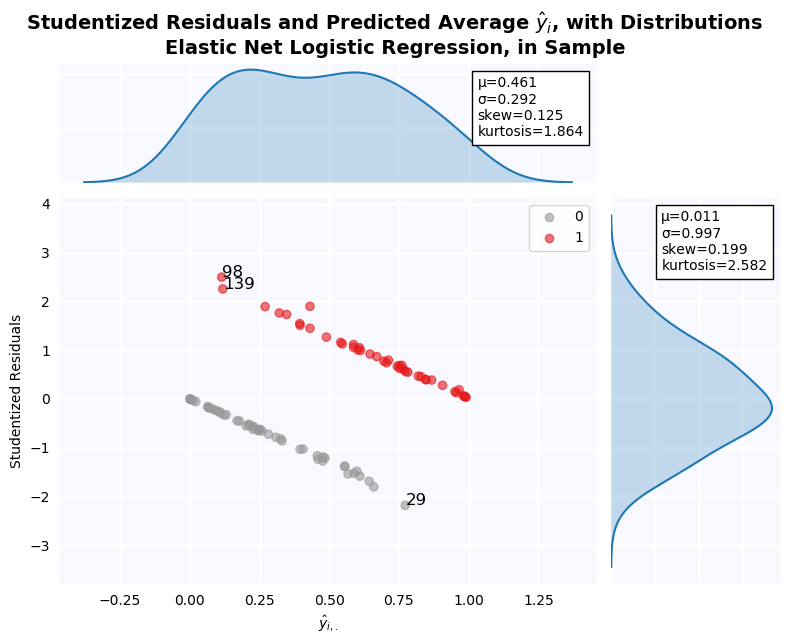
fig, ax = plt.subplots(2, 2, figsize=(24, 12), dpi=100)

for axis, model, title in zip(fig.axes, [logit, gs_lridge, gs_llasso, gs_lelnet],
                        ['Logit', 'Ridge', 'Lasso', 'Elastic Net']):
    plot_class_regions_for_classifier(model.fit(X_train[['Debt/Assets', 'Income/Assets']], y_train),
                                      X_train[['Debt/Assets', 'Income/Assets']], y_train,
                                      X_test = X_test[['Debt/Assets', 'Income/Assets']],
                                      y_test = y_test,
                                      title=title,
                                      target_names=['Non-Default', 'Default'],
                                      ax = axis)
fig.tight_layout()
fig.suptitle('Bivariate Logistic Classification Models with Regularization', fontsize=24, y=1.03)
plt.show()
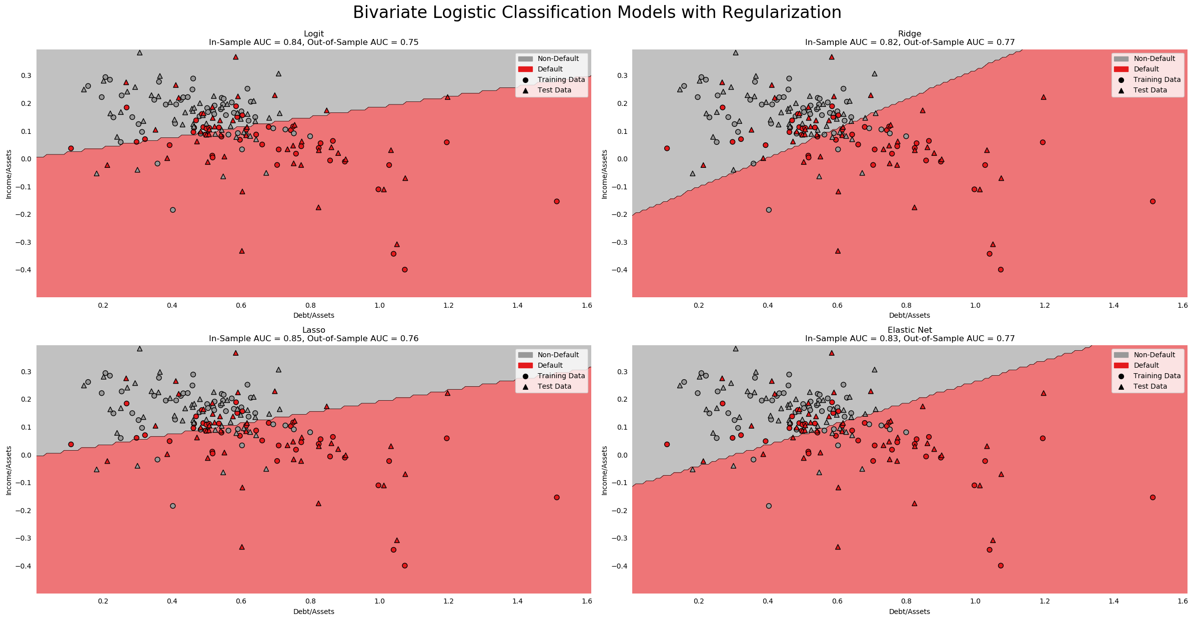
K-Nearest Neighbors Classification
The same KNN algorithm used to interpolate the missing values in Question 21.1 can be used to classify firms. The algorithm memorizes the location of each firm in $\mathbb{R}^N$, then determines the class of a new point via majority vote from the K closest points. This is a totally non-parametric classification method, operating only on the assumption that firms with similar ratios will have a similar outcome.
Using a grid-search to try values of K between 2 and 20 and select the one with the highest in-sample AUC, 4 neighbors is determined to be the best. In-sample AUC is much less overfit than the LPM or logistic models: only .784, with a drop of only .04 moving out-of-sample. Nevertheless, the model still fails to out-perform the published model.
from sklearn.neighbors import KNeighborsClassifier

knn = KNeighborsClassifier()
gs_knn = GridSearchCV(knn, {'n_neighbors':np.arange(2,20)}, scoring='roc_auc').fit(X_train, y_train)
print(f'K Neighbors: {gs_knn.best_params_["n_neighbors"]}')
print(f'In-Sample AUC: {gs_knn.best_score_:0.4f}')
print(f'Out-of-Sample AUC: {roc_auc_score(y_test, gs_knn.best_estimator_.predict_proba(X_test)[:,1]):0.4f}')

auc['knn'] = roc_auc_score(y_test, gs_knn.best_estimator_.predict_proba(X_test)[:,1])
KNN has no weights; it relies on memorization of the training set and computation of Euclidian distances. As a result, there are no coefficient weights or p-values to use as measures of variable importance. To determine which variables have the greatest affect on the model, we need to do permutation analysis. Here, variables are dropped one at a time, and the effect on the solution is measured. Variables with a larger impact on the solution are judged to have a higher importance. The results are plotted below. Long-Term Debt/Assets is by far the most important to his model, followed by Log Assets and Log Sales. The KNN classifier seems to give a sparse solution to the classification problem, as other variables have close to no impact on the results of the model when dropped.
fig, ax = plt.subplots(figsize=(12,6), dpi=100)
permutations = PermutationImportance(gs_knn, scoring='roc_auc').fit(X_train, y_train)
fi = pd.Series(permutations.feature_importances_, index=X_train.columns)
fi = fi[fi.apply(np.abs).apply(lambda x: -x).argsort()]

importance['knn'] = make_ranking(X_train, fi)

ax.bar(fi.index, fi, color=cm.Set1_r(8), alpha=0.7, zorder=2)
ax.bar(fi.index, fi, facecolor='none', edgecolor='black', lw=1.5, zorder=2)
jesse_tools.remove_chart_ink(ax)
ax.tick_params(rotation=90)
ax.grid(lw=0.5, ls='--')
ax.set_title('KNN Classifier Variable Importance, K=4, Computed by Permutation')
plt.show()
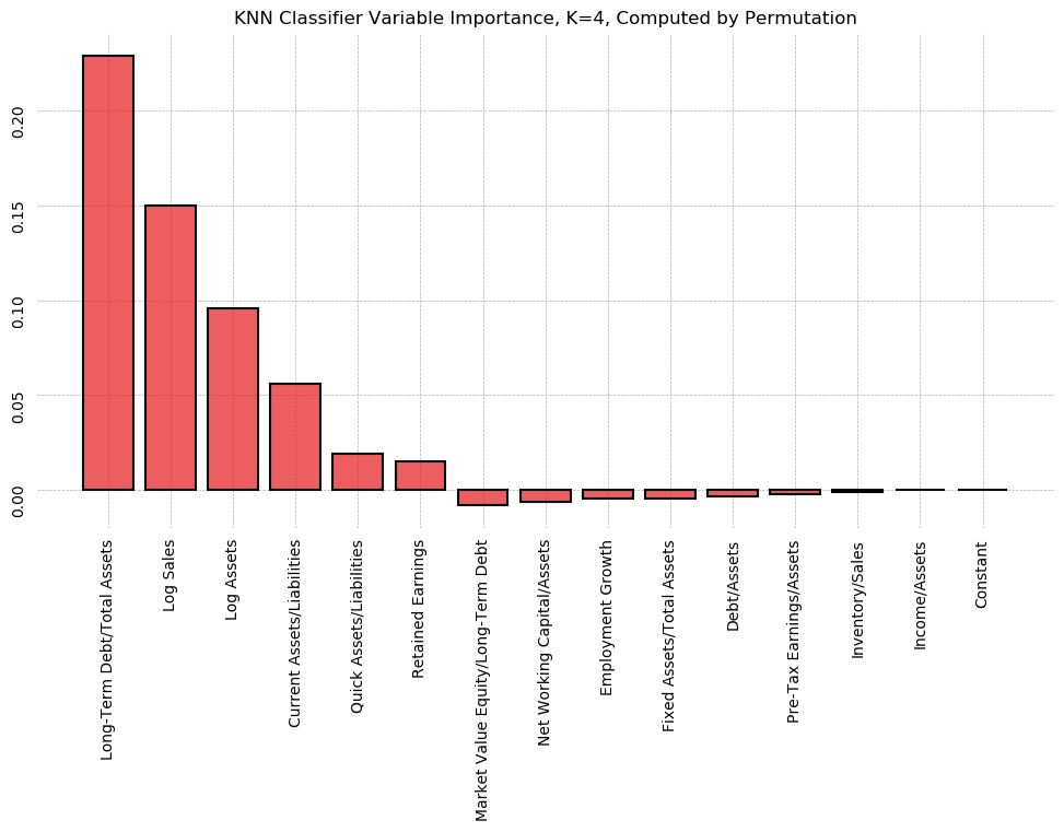
outliers['knn'] = find_outliers(y_train, gs_knn.predict_proba(X_train)[:, 1])

jesse_tools.resid_plot(X_train,
                       model=gs_knn,
                       resids=None,
                       y=y_train,
                       y_hat=gs_knn.predict_proba(X_train)[:,1],
                       outlier_y = [-1.96, 1.96],
                       labels_y=True,
                       title='K-Nearest Neighbors Classification, in Sample', color_col=y_train, cmap='Set1_r')
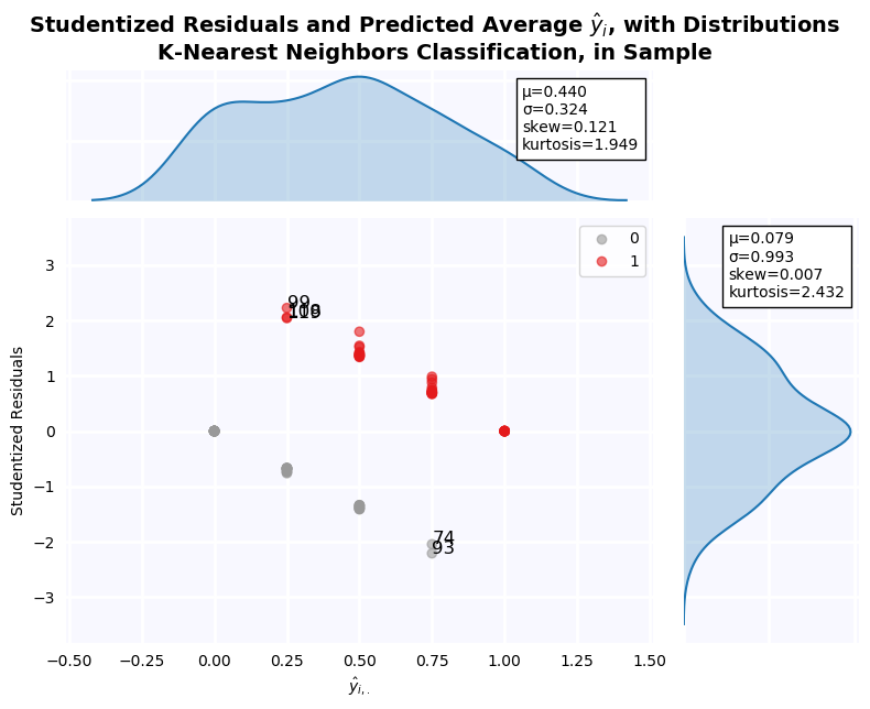
fig, ax = plt.subplots(figsize=(8,6), dpi=100)
plot_class_regions_for_classifier(knn.fit(X_train[['Debt/Assets', 'Income/Assets']], y_train),
                                  X_train[['Debt/Assets', 'Income/Assets']], y_train,
                                  X_test = X_test[['Debt/Assets', 'Income/Assets']],
                                  y_test = y_test,
                                  title='Bivariate K-Nearest Neighbors Classifier, K=4',
                                  target_names=['Non-Default', 'Default'], ax=ax)
plt.show()
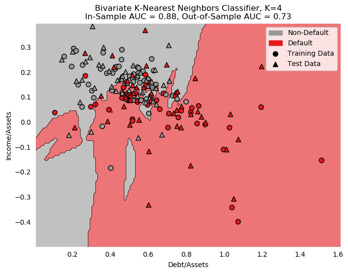
Support Vector Machines
Support Vector Machines will be the first class of estimators that can capture non-linearities, through the use of the Kernel Trick. Created in 1991 by Vladimir Vapnik [6], SVM approaches the question of classification totally different from OLS. A "slack parameter", $\epsilon$, is used to allow deviation from the line of best fit. We begin with a linear regression:
$$ f(x) = \langle w, x \rangle + b, \;\; w \in \mathcal{X}, b \in \mathbb{R}$$Where $\langle w, x \rangle$ is a dot product in $\mathcal{X}$, an input space such as $\mathbb{R}^d$. The goal is to minimize $f(x)$, while allowing at most $\epsilon$ deviation from the data. This leads to the following first order condition:
$$\min_w \frac{1}{2} ||w||^2, \;\;\; s.t. \;\;\; y_i - \langle w, x_i \rangle -b \leq \epsilon, \;\;\; \langle w, x_i \rangle + b - y_i \leq \epsilon$$This can be solved via Langrangian with Khun-Tucker conditions, but we can also introduce regularization by adding a "slack" terms $\zeta_i$ and $\zeta^\star$, and changing the Khun-Tucker conditions to:
$$y_i - \langle w, x_i \rangle -b \leq \epsilon + \zeta_i, \;\;\; \langle w, x_i \rangle + b - y_i \leq \epsilon + \zeta_i^\star, \;\;\; \zeta_i, \zeta_i^\star \geq 0$$And now add the sum of all slack terms, plus a regularization parameter, to the minimization:
$$\min_w \frac{1}{2} ||w||^2 + C \sum_i (\zeta_i + \zeta^\star_i)$$Taking everything together, the final objective function will be:
$$\min_{w,b,\lambda_1, \lambda_2, \lambda_3, \lambda_4} \frac{1}{2} ||w||^2 + C \sum_{i=1}^N \left(\zeta_i + \zeta^\star_i\right) - \lambda_{1,i} \sum_{i=1}^N \zeta_i - \lambda_{2,i} \sum_{i=1}^N \zeta^\star_i - \lambda_{3,i} \sum_i^N \left(\epsilon + \zeta_i - y_i + \langle w, x_i \rangle + b\right) - \lambda_{4,i} \sum_{i=1}^N \left(\epsilon + \zeta^\star_i + y_i - \langle w, x_i \rangle - b\right)$$$$ s.t. \;\;\; \lambda_1, \lambda_2, \lambda_3 \geq 0$$Where $\lambda_1, \lambda_2, \lambda_3, \lambda_4$ are the langrangians associated with all Khun-Tucker conditions. Smola and Sholkopf present a nice solution to the problem using dual optimization, which yields:
$$f(x) = \sum_{i=1}^N (\lambda_{3,i} - \lambda_{4,i}) \langle x_i, x \rangle + b $$This is a nice solution because the term $(\lambda_{3,i} - \lambda_{4,i})$ is 0 for points inside the epsilon tube (by definition, as the condition is non-binding for these points). This is the origin of the name "Support Vector Machines"; only vectors outside of the epsilon tube are required to compute the solution, saving computing power.
The other nice thing about the solution is that the solution depends on a dot product of $x_i$, rather than $x_i$ itself, so we are free to do transformations on the variables as long as the results depend only on dot products. We can instead write the solution as:
$$f(x) = \sum_{i=1}^N (\lambda_{3,i} - \lambda_{4,i}) \langle \Phi(x_i), \Phi(x) \rangle + b $$Where $\Phi$ is an arbitrary transformation that we are free to choose. For example, if x is a vector with 2 components, to capture quadratic dynamics we can define:
$$\Phi(x) = \left(x_1^2, \sqrt{2}x_1x_2, x_2^2\right)$$So that:
$$ \langle \Phi(x), \Phi(x^\prime) \rangle = \langle \left(x_1^2, \sqrt{2}x_1x_2, x_2^2\right), \left(x^{\prime 2}_1, \sqrt{2}x^\prime_1 x^\prime_2, x^{\prime 2}_2\right) \rangle = \langle x, x^\prime \rangle^2$$This is known as the kernel trick, and allows for computation of infinite-dimensional interactions without spending more computing power than just a dot product, which is very nice.
In our implementation of SVM, we will try several kernels: polynomials, sigmoid, and Gaussian Radial Basis, each with their own hyper-parameters. Polynomial of order 4 is found to maximize cross-validated AUC within the training set. The pseudo-residuals are plotted below, along with a representation of the decision boundary in the bivariate case.
from sklearn.svm import SVC
# This is a long boring grid search algorithm that tries lots of combinations of tunable hyperparameters
# to find which has the best AUC score. It is commented out because it takes a long time to run (~10 minutes on my Intel i7)
# The best results found by the alogrith are:

# {'C': 1, 'coef0': 4, 'gamma': 1, 'kernel': 'poly'}

# This best model is directly implemented below.

# svc = SVC(probability=True)
# gs_svc = GridSearchCV(svc, {'C':np.arange(1,100),
#                             'kernel':['rbf', 'poly', 'sigmoid'],
#                             'coef0':np.arange(1,10),
#                             'gamma':np.arange(1,10),
#                             'probability':[True]}, scoring='roc_auc', n_jobs=-1).fit(X_train, y_train)

svc = SVC(C=1, coef0=4, kernel='poly', probability=True).fit(X_train, y_train)
print('Support Vector Machine with 4th Order Polynomial Kernel')
print(f'In-Sample AUC: {roc_auc_score(y_train, svc.predict_proba(X_train)[:, 1]):0.4f}')
print(f'Out-of-Sample AUC: {roc_auc_score(y_test, svc.predict_proba(X_test)[:,1]):0.4f}')

auc['svc'] = roc_auc_score(y_test, svc.predict_proba(X_test)[:,1])
outliers['svm'] = find_outliers(y_train, svc.predict_proba(X_train)[:, 1])

jesse_tools.resid_plot(X_train,
                       model=svc,
                       resids=None,
                       y=y_train,
                       y_hat=svc.predict_proba(X_train)[:,1],
                       outlier_y = [-1.96, 1.96],
                       labels_y=True,
                       title='Support Vector Machine Classification, in Sample', color_col=y_train, cmap='Set1_r')
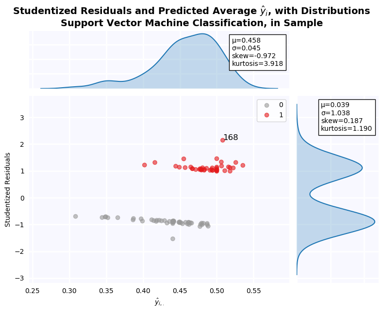
The coefficient weights don't actually appear in the solution to the SVM objective function. When a simple linear kernel is used, they can be recovered, but this is not case for other kernel transformation, such as the polynomial used here. As a result, we cannot determine variable importance by comparing the size of coefficients or p-values. Instead, we need to do permutation analysis. The result of this permutation analysis is reported below in a bar chart. 3 variables are found to be much more important than others: Log Sales, Long-Term Debt/Total Assets, and Log Assets.
fig, ax = plt.subplots(figsize=(12,6), dpi=100)
permutations = PermutationImportance(svc, scoring='roc_auc').fit(X_train, y_train)
fi = pd.Series(permutations.feature_importances_, index=X_train.columns)
fi = fi[fi.apply(np.abs).apply(lambda x: -x).argsort()]

importance['svm'] = make_ranking(X_train, fi)

ax.bar(fi.index, fi, color=cm.Set1_r(8), alpha=0.7, zorder=2)
ax.bar(fi.index, fi, facecolor='none', edgecolor='black', lw=1.5, zorder=2)
jesse_tools.remove_chart_ink(ax)
ax.tick_params(rotation=90)
ax.grid(lw=0.5, ls='--')
ax.set_title('Polynomial Order 4 SVM Variable Importance, Computed by Permutation')
plt.show()
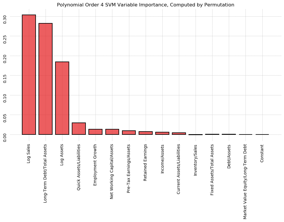
fig, ax = plt.subplots(figsize=(8,6), dpi=100)
plot_class_regions_for_classifier(svc.fit(X_train[['Debt/Assets', 'Income/Assets']], y_train),
                                  X_train[['Debt/Assets', 'Income/Assets']], y_train,
                                  X_test = X_test[['Debt/Assets', 'Income/Assets']],
                                  y_test = y_test,
                                  title='Bivariate Support Vector Machine, Polynomial Kernal, Order 4',
                                  target_names=['Non-Default', 'Default'], ax=ax)
plt.show()
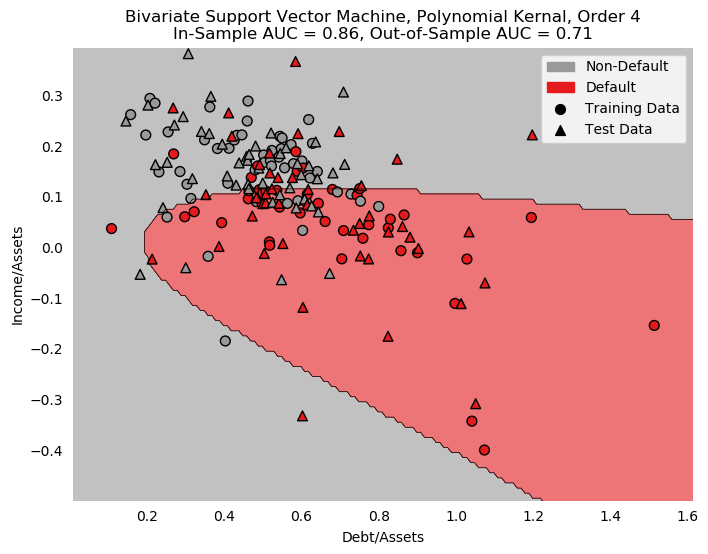
CART Algorithms and Ensemble Learners
Having failed with the non-linear parametric models explored so far, we turn now to non-parametric decision trees. We saw already in question 16 how decision trees simply divide the data iteratively on features, attempting to produce pure leaves.
Decision Tree
from sklearn.tree import DecisionTreeClassifier
from sklearn.ensemble import RandomForestClassifier, GradientBoostingClassifier, AdaBoostClassifier

tree = DecisionTreeClassifier().fit(X_train, y_train)
importance['tree'] = make_ranking(X_train, tree.feature_importances_)
print('Simple Decision Tree, Split to all pure leaves, Gini Purity')
print(f'In-Sample AUC: {roc_auc_score(y_train, tree.predict_proba(X_train)[:, 1]):0.4f}')
print(f'Out-of-Sample AUC: {roc_auc_score(y_test, tree.predict_proba(X_test)[:,1]):0.4f}')

auc['tree'] = roc_auc_score(y_test, tree.predict_proba(X_test)[:,1])
fig, ax = plt.subplots(figsize=(8,6), dpi=100)
plot_class_regions_for_classifier(tree.fit(X_train[['Debt/Assets', 'Income/Assets']], y_train),
                                  X_train[['Debt/Assets', 'Income/Assets']], y_train,
                                  X_test = X_test[['Debt/Assets', 'Income/Assets']],
                                  y_test = y_test,
                                  title='Bivariate Decision Tree, Gini Purity, Split to Pure Leaves',
                                  target_names=['Non-Default', 'Default'], ax=ax)
plt.show()
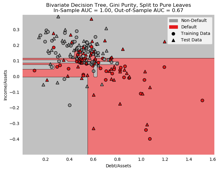
Random Forest
Decision Trees are extremely flexible, and allow for a great deal of interesting learning strategies. Two popular ones are shallow learner approaches. Rather than splitting to total purity, a maximum depth is selected, and the decision tree splits only to this depth, then computes predictions. After making many such shallow trees, a "majority vote" is held between all the trees for final class assignment.
There are many strategies for how to grow these shallow trees. We consider two here: Random Forests, and Gradient Boosted Decision Trees. Random Forests try to create as many trees as possible, adding additional variation by randomly bootstrapping observations, and by randomly selecting $p < k$ variables to use when growing a new tree. The theory is wisdom of the crowds: many poor classifiers that all see very different data, averaged together, should be better than a single "perfect" classifier. The strategy works extremely well in practice, and has a large number of hyper-parameters to tune, allowing for increased performance.
Here, a grid search of hyper parameters showed we should consider trees of max depth 3, consider only 10% of available data points, use 6 randomly selected variables, and grow a total of 100 trees. The resulting classifier has an out-of-sample AUC of .789, which makes it the first classifier we've seen that is superior to the published logistic regression.
Like decision trees, a random forest can also measure variable importance using gini purity. This is graphed below. We see that Income/Assets is the most important variable in the forest, followed by Employment Growth, Pre-Tax Earnings/Assets, Long-Term Debt/Assets, and Retained Earnings.
When plotting studentized pseudo-residuals, there are no outlier firms with beyond $\pm 2\sigma$, indicating that the model does a reasonable job classifying all points. In the bivariate model, we can see why. The decision boundary darts in and out of the main cloud of points, but is not overly complex like that of the KNN or Decision Tree classifiers.
# GridSearch results:

# {'bootstrap': True,
#  'max_depth': 3,
#  'max_features': 6,
#  'max_samples': 0.1111111111111111,
#  'n_estimators': 100}

# rf = RandomForestClassifier(n_jobs=-1)
# gs_rf = GridSearchCV(rf, {'n_estimators':np.arange(50,500,50),
#                          'max_depth':np.arange(2,20,1),
#                          'max_features':['sqrt', 'log2', 3,4,5,6,7,8,9,10],
#                          'bootstrap':[True, False],
#                          'max_samples':np.linspace(0,1,10)}, scoring='roc_auc', n_jobs=-1).fit(X_train, y_train)

rf = RandomForestClassifier(bootstrap=True, max_depth=3, max_features=6,
                            max_samples=0.1, n_estimators=100, n_jobs=-1, random_state=0).fit(X_train, y_train)

print('Random Forest, Max Depth=3, max_samples=10%, Bootstrap=True, n_Trees=100')
print(f'In-Sample AUC: {roc_auc_score(y_train, rf.predict_proba(X_train)[:, 1]):0.4f}')
print(f'Out-of-Sample AUC: {roc_auc_score(y_test, rf.predict_proba(X_test)[:,1]):0.4f}')

auc['rf'] = roc_auc_score(y_test, rf.predict_proba(X_test)[:,1])
fig, ax = plt.subplots(figsize=(12,6), dpi=100)

fi = pd.Series(rf.feature_importances_, index=X_train.columns)
fi = fi[fi.apply(np.abs).apply(lambda x: -x).argsort()]

importance['rf'] = make_ranking(X_train, fi)

ax.bar(fi.index, fi, color=cm.Set1_r(8), alpha=0.7, zorder=2)
ax.bar(fi.index, fi, facecolor='none', edgecolor='black', lw=1.5, zorder=2)
jesse_tools.remove_chart_ink(ax)
ax.tick_params(rotation=90)
ax.grid(lw=0.5, ls='--')
ax.set_title('Random Forest Variable Importance, Computed by Gini Purity')
plt.show()
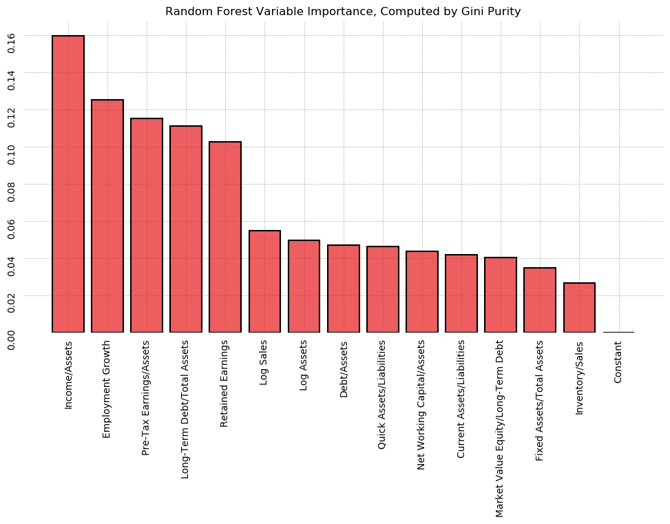
outliers['random forest'] = find_outliers(y_train, rf.predict_proba(X_train)[:, 1])

jesse_tools.resid_plot(X_train,
                       model=rf,
                       resids=None,
                       y=y_train,
                       y_hat=rf.predict_proba(X_train)[:,1],
                       outlier_y = [-1.96, 1.96],
                       labels_y=True,
                       title='Random Forest Classification, in Sample', color_col=y_train, cmap='Set1_r')
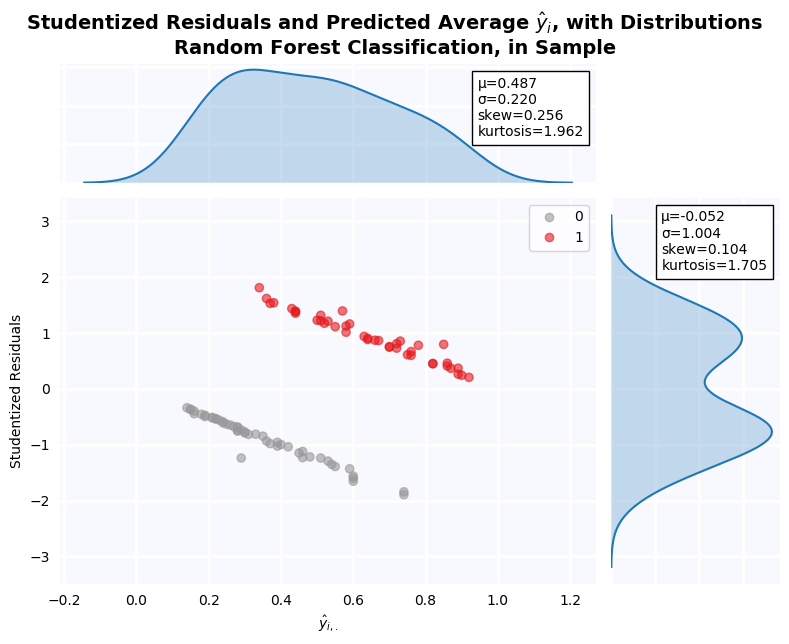
fig, ax = plt.subplots(figsize=(8,6), dpi=100)
rf_plot = RandomForestClassifier(bootstrap=True, max_depth=3, max_features='auto', max_samples=0.1,
                            n_estimators=100, n_jobs=-1, random_state=0)\
                            .fit(X_train, y_train)
plot_class_regions_for_classifier(rf_plot.fit(X_train[['Debt/Assets', 'Income/Assets']], y_train),
                                  X_train[['Debt/Assets', 'Income/Assets']], y_train,
                                  X_test = X_test[['Debt/Assets', 'Income/Assets']],
                                  y_test = y_test,
                                  title='Bivariate Random Forest, Max Depth=3, max_samples=10%, Bootstrap=True, n_Trees=100',
                                  target_names=['Non-Default', 'Default'], ax=ax)
plt.show()
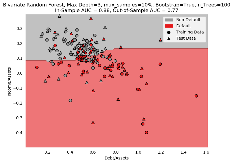
Gradient Boosted Decision Trees
Another strategy for growing many shallow learners is to try to have each new tree learn from the mistakes of the previous trees. This is the approach of Gradient Boosting. Rather than introducing lots of variance, Gradient Boosting algorithms like AdaBoost and XGBoost start with a single tree and make estimates. Then a new dataset is bootstrapped, where each point has a probability of selection proportional to the size of the pseudo-residuals from the previous classification. Thus, poorly classified points have a bigger chance of being chosen, and the bootstrapped sample will have more "difficult" observations that easy ones. Observations are re-classified, and pseudo-residuals are re-computed as the weighted average of the previous tree and the current tree, with the new estimates scaled by a "learning rate" to prevent the algorithm from diverging. This process continues until n_estimators is reached.
As usual, a grid search is used to tune hyper-parameters. 10% of the sample is considered in each tree, with a max depth of 4, and a total of 50 trees. Unlike the random forest, all variables are included in every tree. The out-of-sample AUC performed much worse than the random forest approach, at only .735. The decision boundary in the bivariate case is much too complicated, revealing the overfitting visible in the in-sample vs out-of-sample AUC scores.
In terms of feature importance, 2 of the top 3 important features are the same as the random forest, but Income/Assets is not judged to be very important at all, while Long-Term Debt/Total Assets is.
# GridSearch results:
# {'learning_rate': 0.1,
#  'max_depth': 4,
#  'max_features': None,
#  'n_estimators': 50,
#  'subsample': 0.1}

#gbc = GradientBoostingClassifier()
# gs_gbc = GridSearchCV(gbc, {'n_estimators':np.arange(50,550,50),
#                             'subsample':np.arange(0.1,1.1,.1),
#                             'learning_rate':np.arange(0.1, 1.1, .1),
#                             'max_depth':np.arange(3,11,1),
#                             'max_features':['sqrt', 'log2', None]},
#                      n_jobs=-1,
#                      verbose=1,
#                      scoring='roc_auc').fit(X_train, y_train)

gbc = GradientBoostingClassifier(learning_rate=0.1, max_depth=4,
                                 max_features=None, n_estimators=50, subsample=0.1, random_state=0).fit(X_train, y_train)

print('Gradient Boosted Decision Trees, Max Depth=4, max_samples=100, n_Trees=50, learning_rate=0.1')
print(f'In-Sample AUC: {roc_auc_score(y_train, gbc.predict_proba(X_train)[:, 1]):0.4f}')
print(f'Out-of-Sample AUC: {roc_auc_score(y_test, gbc.predict_proba(X_test)[:,1]):0.4f}')

auc['gbc'] = roc_auc_score(y_test, gbc.predict_proba(X_test)[:,1])
fig, ax = plt.subplots(figsize=(12,6), dpi=100)

fi = pd.Series(gbc.feature_importances_, index=X_train.columns)
fi = fi[fi.apply(np.abs).apply(lambda x: -x).argsort()]

importance['gbc'] = make_ranking(X_train, fi)

ax.bar(fi.index, fi, color=cm.Set1_r(8), alpha=0.7, zorder=2)
ax.bar(fi.index, fi, facecolor='none', edgecolor='black', lw=1.5, zorder=2)
jesse_tools.remove_chart_ink(ax)
ax.tick_params(rotation=90)
ax.grid(lw=0.5, ls='--')
ax.set_title('Graident Boosed Decision Tree Variable Importance, Computed by Gini Purity')
plt.show()
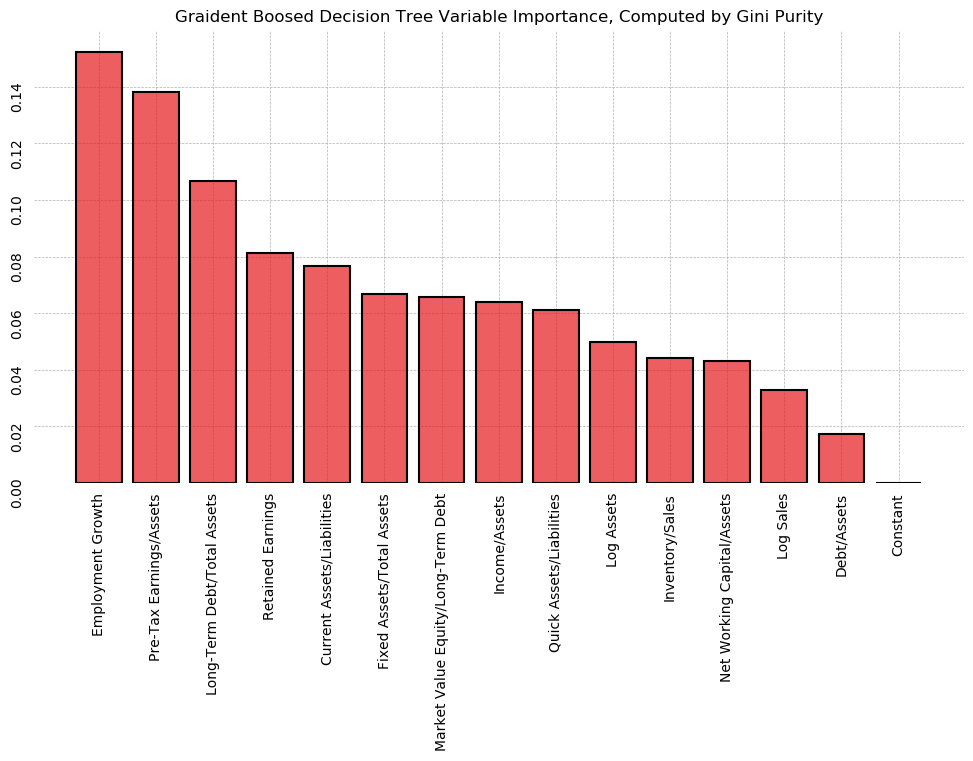
outliers['gradient boost'] = find_outliers(y_train, gbc.predict_proba(X_train)[:, 1])

jesse_tools.resid_plot(X_train,
                       model=gbc,
                       resids=None,
                       y=y_train,
                       y_hat=gbc.predict_proba(X_train)[:,1],
                       outlier_y = [-1.96, 1.96],
                       labels_y=True,
                       title='Gradient Boosted Decision Tree Classification, in Sample', color_col=y_train, cmap='Set1_r')
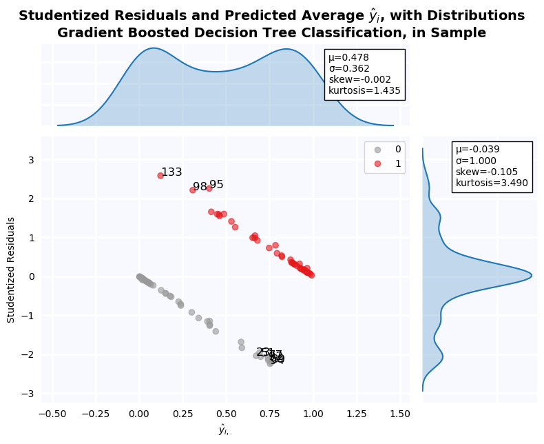
fig, ax = plt.subplots(figsize=(8,6), dpi=100)
title='Bivariate Gradient Boosted Decision Trees, Max Depth=4, max_samples=100, n_Trees=50, learning_rate=0.1'
plot_class_regions_for_classifier(gbc.fit(X_train[['Debt/Assets', 'Income/Assets']], y_train),
                                  X_train[['Debt/Assets', 'Income/Assets']], y_train,
                                  X_test = X_test[['Debt/Assets', 'Income/Assets']],
                                  y_test = y_test,
                                  title=title,
                                  target_names=['Non-Default', 'Default'], ax=ax)
plt.show()
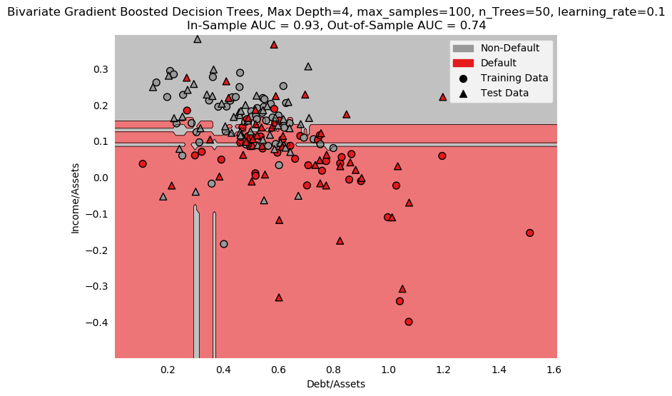
Feed-Forward Neural Network
Neural Networks are the gold standard of machine learning algorithms, so I would be remiss not to include one. They are highly flexible, and provide a framework from which any arbitrary nonlinear relationship between the variables can be captured.
At a high level, the network consists of repeated regression. Each node in the network receives a signal vector X, and computes $g(X\beta + C)$. This is identical to standard linear regression, expect for the function $g()$. In fact, linear regression can be viewed as a special case of Neural Network, with only a single output node and $g()$ as the identity function, $g(x) = x$.
In general, however, multiple layers and nodes are used. Each layer computes it's own weights, and the results are passed to the next layer as a new set of inputs.
All this is extremely arbitrary: the number of layers, and the number of nodes in each layer, is entirely up to the user. In addition, the function $g(x)$ is entirely arbitrary as well, with several popular choices (logistic, hypertan, or Relu (max(0, x) are all used).
In addition, Neural Networks use stochastic gradient descent to find computationally efficient solutions, as well as random initial weights, meaning no two sessions of the same model are guaranteed to yield the same results (unless we set a random seed).
In this case, an extremely good result was achieved using 2 hidden layers, the first with 13 nodes and the second with 4, and a logistic activation function. 2 hidden layers were selected because it has been shown theoretically that a single hidden layer can represent any arbitrary function, while in practice researchers say that two hidden layers allow the network to find any decision boundary, provided inputs and outputs are continuous and rational.
The numbers 13 and 4, as well as the logistic function, were chosen by iterating over every possible combination of 2 hidden layers, plus all activation functions, looking for a maximum test set AUC. Note that this is massively cheating. I should not have access to so many peeks at the test set. I justify this in two ways:
- Data limitations prevent me from using cross-validation for model selection, as is normally the case
- The model is not shown the test data in training, and the final model is not overfit, per se.
An alternative, then, is permutation analysis. Retained Earnings and Log Sales are found to be, by far, most important to the network's decision, followed by Employment Growth, Debt/Assets, and Long-Term Debt/Total Assets.
from sklearn.neural_network import MLPClassifier
from sklearn.preprocessing import MinMaxScaler

scaler = MinMaxScaler().fit(X_train)
X_train_scaled = scaler.transform(X_train)
X_test_scaled = scaler.transform(X_test)

mlp = MLPClassifier(max_iter=5000, random_state=0,
                    activation='logistic', hidden_layer_sizes=(13, 4)).fit(X_train_scaled, y_train)

print(f'Neural Network')
print(f'In-Sample AUC: {roc_auc_score(y_train, mlp.predict_proba(X_train_scaled)[:, 1]):0.4f}')
print(f'Out-of-Sample AUC: {roc_auc_score(y_test, mlp.predict_proba(X_test_scaled)[:,1]):0.4f}')

auc['fnn'] = roc_auc_score(y_test, mlp.predict_proba(X_test_scaled)[:,1])
outliers['mlp'] = find_outliers(y_train, mlp.predict_proba(X_train_scaled)[:, 0])

jesse_tools.resid_plot(pd.DataFrame(X_train_scaled),
                       model=None,
                       resids=None,
                       y=y_train,
                       y_hat=mlp.predict_proba(X_train_scaled)[:,0],
                       outlier_y = [-1.96, 1.96],
                       labels_y=True,
                       title='Neural Network, 2 Hidden Layers', color_col=y_train, cmap='Set1_r')
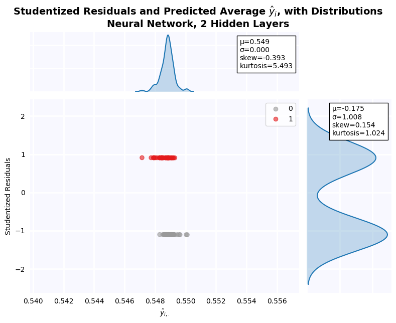
permutations = PermutationImportance(mlp, scoring='roc_auc', cv='prefit', random_state=0).fit(X_train_scaled, y_train)

fig, ax = plt.subplots(figsize=(12,6), dpi=100)

fi = pd.Series(permutations.feature_importances_, index=X_train.columns)
fi = fi[fi.apply(np.abs).apply(lambda x: -x).argsort()]

importance['fnn'] = make_ranking(X_train, fi)

ax.bar(fi.index, fi, color=cm.Set1_r(8), alpha=0.7, zorder=2)
ax.bar(fi.index, fi, facecolor='none', edgecolor='black', lw=1.5, zorder=2)
jesse_tools.remove_chart_ink(ax)
ax.tick_params(rotation=90)
ax.grid(lw=0.5, ls='--')
ax.set_title('Neural Network Variable Importance, Computed by Permutation')
plt.show()
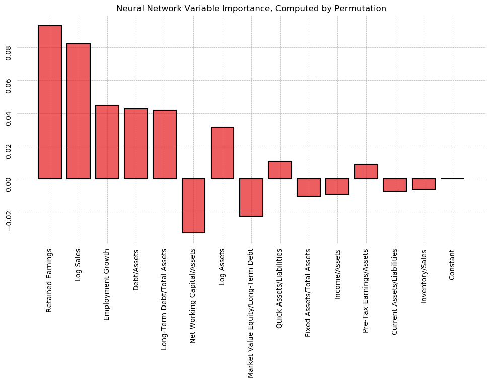
Putting it All Together
Summary of Out-of-Sample AUC
Recalling that the benchmark model, the published model, has an out-of-sample AUC of .784, the out-of-sample results for all the ML models are presented below, from greatest to least. Only 2 models, the Neural Network and the Random Forest, out perform the simple logistic model with expert-selected variables. This highlights a major limitation of machine learning: the need for large datasets. With only 90 observations in the training set, it was difficult for the models to learn which variables were most important when presented with all available data.
models = {'fnn':'Neural Network', 'rf':'Random Forest', 'knn':'K-Nearest Neighbors', 'gbc':'Gradient Boosted Forest',
          'elnet_lpm':'Linear Elasic Net', 'lasso_lpm':'Linear Lasso', 'svc':'Support Vector Machine',
          'ridge_logit':'Logistic Ridge', 'elnet_logit':'Logistic Elastic Net', 'lasso_logit':'Logistic Lasso',
          'tree':'Decision Tree', 'ridge_lpm':'Linear Ridge', 'svm':'Support Vector Machine'}

auc_matrix = pd.Series(auc)
auc_matrix.rename(index=models, inplace=True)
auc_matrix.apply(lambda x: format(x, '0.3f')).sort_values(ascending=False)
Outlier Detection
The next thing that can be drawn from all these models is which firms are persistently misclassified in the training data. Across all 12 models, the firms with studentized pseudo-residuals greater than 2 or less than -2 were recored. The bar chart below summarizes the findings. Firm 139 was an outlier in 6 of the 12 models, while firm 98 was in 4 out of 12. These can thus be eliminated from the sample.
counts = {}
for outlier in outliers.values():
    for v in outlier:
        counts[str(v)] = 0

for outlier in outliers.values():
    for v in outlier:
        counts[str(v)] += 1

fig, ax = plt.subplots(figsize=(8,4), dpi=100)
ax.bar(counts.keys(), counts.values(), color=cm.Set1_r(8), alpha=0.7, zorder=2)
ax.bar(counts.keys(), counts.values(), color='none', edgecolor='black', zorder=2)
jesse_tools.remove_chart_ink(ax)
ax.grid(ls='--', lw=0.5)
ax.set_title('Number of Outliers by Firm, all Machine Learning Models')
ax.set_xlabel('Firm')
ax.set_ylabel('n Models Labeled as Outlier')
plt.show()
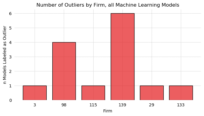
Variable Selection
After running 12 models, there is a much richer information set from which to evaluate features. The importances of each feature, as evaluated by either coefficient size, Gini purity, or perturbation analysis, are presented below. Lower numbers indicate higher importance, so for example, Retained Earnings was the most important feature in the Neural Network. To get a global sense of the most important variables, the sum across rows is computed and subtracted from 225. To attempt to give more weight to better performing models, the rankings of each variable are also multiplied by the model out-of-sample AUC, then summed. The results are graphed below.
In both cases, Employment Growth is found to be the most important overall feature, followed by Pre-Tax Earnings/Assets. Whether or not weights are added, the next 3 are Net Working Capital/Assets, Log Sales, and Retained Earnings, though weights change the specific order. The bottom 6 are also stable to the AUC weighting.
In general, feature importance declines smoothly and linearly, with no clear "elbow" at which to draw a cutoff line. More parsimonious models could be attempted by slowly adding features in the order of overall importance and measuring the effect on the AUC score.
importance_matrix = pd.DataFrame(importance, index=X_train.columns).rename(columns=models)
importance_matrix
fig, ax = plt.subplots(1, 2, figsize=(16,4), dpi=100)
bars0 = importance_matrix.sum(axis=1).apply(lambda x: 225 - x).sort_values(ascending=False)
bars1 = importance_matrix.T.apply(lambda x: x * auc_matrix[x.index], axis=0).T.sum(axis=1)\
                            .apply(lambda x: 225 - x).sort_values(ascending=False)
ax[0].bar(bars0.index, bars0, color=cm.Set1_r(8), alpha=0.7, zorder=2)
ax[0].bar(bars0.index, bars0, facecolor='none', edgecolor='black', zorder=2)
ax[0].set_title('Unweighted')
ax[1].bar(bars1.index, bars1, color=cm.Set1_r(8), alpha=0.7, zorder=2)
ax[1].bar(bars1.index, bars1, facecolor='none', edgecolor='black', zorder=2)
ax[1].set_title('Weighted by Model AUC')
for axis in fig.axes:
    jesse_tools.remove_chart_ink(axis)
    axis.tick_params(rotation=90)
    axis.grid(ls='--', lw=0.5)

plt.show()
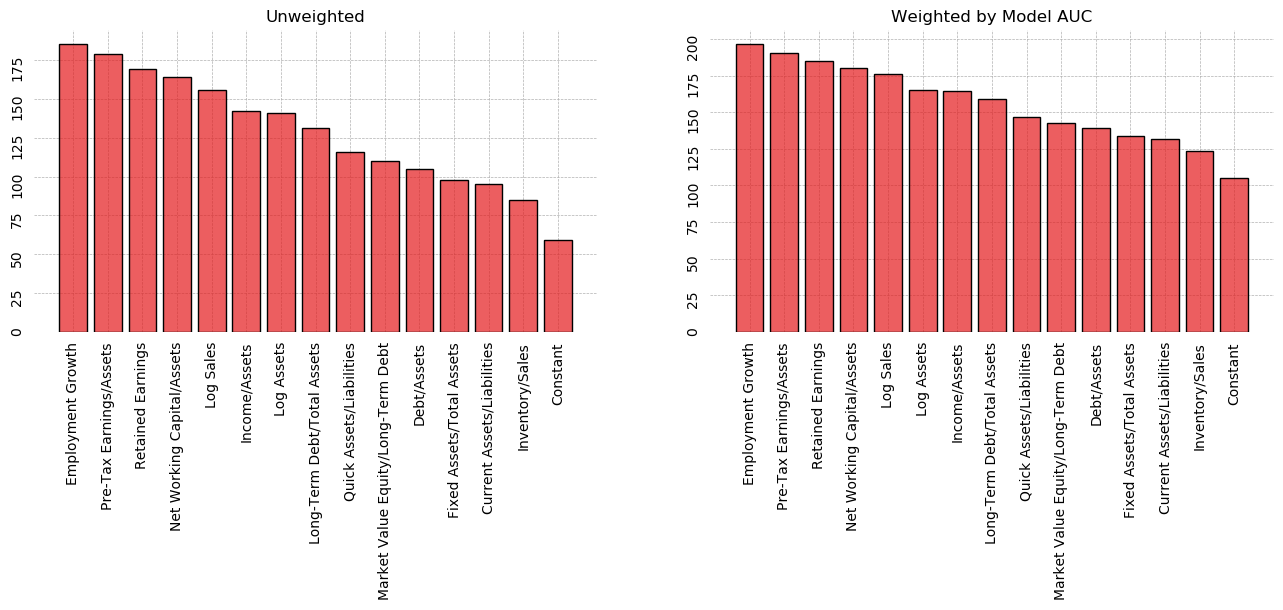
Kendall's Tau
Similarity of variable importance between models can also be compared using Kendall's Tau, a measure of ordinal agreement. The statistic is given:
$$ \tau(x, y) = \frac{(P - Q)}{\sqrt{((P + Q + T) \cdot (P + Q + U))}} $$Where P is the number of concordant pairs, Q is the number of discordant pairs, T is the number of ties in x, and U is the number of ties in y. If there is a tie in both x and y, the pair is ignored.
Pairs with a high Kendall's Tau give the same ordinal ranking to variable importance. The statistics are plotted in the heat map below, with the color set to the p-value of the statistic. Dark squares are strongly significant, while beige colors are not significant at the 10% level. Unsurprisingly, the family of regularized linear classifiers largely agree on variable importance. K-Nearest Neighbors and Support Vector Machine also strongly agree on ranking. The model which seems to best capture the consensus of the entire group is the Random Forest, which ranked variables similarly to all models except KNN and Decision Trees.
This, combined with it's high but not "cheated" out-of-sample AUC, make it the preferred model considered here.
tau_matrix = pd.DataFrame(np.zeros((12, 12)), columns=importance_matrix.columns, index=importance_matrix.columns)
pval_matrix = pd.DataFrame(np.zeros((12, 12)), columns=importance_matrix.columns, index=importance_matrix.columns)
for i in range(12):
    for j in range(12):
        tau_matrix.iloc[i, j] = stats.kendalltau(importance_matrix.iloc[:, i], importance_matrix.iloc[:, j])[0]
        pval_matrix.iloc[i, j] = stats.kendalltau(importance_matrix.iloc[:, i], importance_matrix.iloc[:, j])[1]
fig, ax = plt.subplots(figsize=(8,8), dpi=100)
sns.heatmap(pval_matrix.applymap(lambda x: x if x < 0.1 else 1), vmin=0, vmax=0.15, annot=tau_matrix, ax=ax)
ax.set_title("Kendall's Tau Statistic for Agreement of Ordinal Ranking, Colored by P-value")
plt.show()
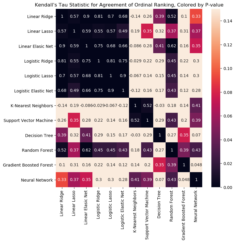
Scoring the Preferred Model
Given that the Random Forest was the only model that scored higher than the published model, we now score it. An optimum iso-cost curve is computed below to determine a threshold, and confusion matrices are built using this threshold. The iso-cost curve using the same numerical example as before is plotted along with the Random Forest classifier error curve, along with that of the step-out and published models for comparison. The Random Forest achieves fewer false positives in-sample without making a single false negative, allowing the loss function to drop to -105 at a higher threshold of 0.33.
Retraining the model with identified outliers dropped was considered, but damaged model performance. As a result, all observations are included in this final scoring section.
fig, ax =  plt.subplots(figsize=(8,6), dpi=100)

FNs_rf = np.zeros(100)
FPs_rf = np.zeros(100)
FNs_pub = np.zeros(100)
FPs_pub = np.zeros(100)


# Find the number of False Positives and False Negatives associated with the model
thresholds = np.linspace(0, 1, 100)
for i, s in enumerate(thresholds):
    TP, FP, FN, TN = jesse_tools.score_classifier(y_train,
                                                  [1 if x > s else 0 for x in rf.predict_proba(X_train)[:, 1]])
    FNs_rf[i] = FN
    FPs_rf[i] = FP

for i, s in enumerate(thresholds):
    TP, FP, FN, TN = jesse_tools.score_classifier(y_train,
                                                  [1 if x > s else 0 for x in results[6].predict(X_train[published])])
    FNs_pub[i] = FN
    FPs_pub[i] = FP

# We cannot do linear interpolation if a single value of FN maps to several values of FP, so we add a tiny regulatization
# term to ensure all pairs of (FN, FP) are unique
for i in range(1, len(FPs_rf)-1):
    if FPs_rf[i] == FPs_rf[i-1]:
        FPs_rf[i:] += 1e-3
    if FNs_rf[i] == FNs_rf[i-1]:
        FNs_rf[i:] += 1e-3

#Append values -10 to -1 to FN to plot the iso-cost curve up beyond the graph (more beautiful)
exes = list(range(-10, 0))
exes += list(FNs_rf)

# Find tangent line to the curve by looking for the loss curve which both intersects the trade-off curve and
# is always below it.

for FP, FN in zip(FPs_rf, FNs_rf):
    loss = np.array([loss_function(n, FP, FN) for n in exes])
    if all((FPs_rf - loss[10:]) >= 0):
        idx = FPs_rf.tolist().index(FP)
        break

# Compute loss function at the point of tangency
TP, FP_o, FN_o, TN = jesse_tools.score_classifier(y_train,
                                              [1 if x > thresholds[idx] else 0 for x in rf\
                                               .predict_proba(X_train)[:, 1]])

L = -5 * FP_o - 50 * FN_o

#Finally plot everything
ax.plot(FNs_rf, FPs_rf, label='False Positive/False Negative Trade-off Curve', color=cm.Set1_r(8), lw=2)
ax.plot(FNs, FPs, alpha=0.3, label='Step-Out Model')
ax.plot(FNs_pub, FPs_pub, alpha=0.3, label='Published Model')

ax.plot(exes, loss, label='Iso-Cost Curve, $\mathcal{L}=$' + f'{L:0.2f}', color=cm.Set1_r(0), lw=2, ls='--')

xcs, ycs = interpolated_intercepts(FNs_rf, FPs_rf, loss[10:])
plt.plot(xcs[0], ycs[0], marker='o', color='black', ms=5, label=f'Threshold of Tangency, s={thresholds[idx]:0.2f}')

ax.set_ylim([0, 50])
ax.set_xlim([-1, 45])

jesse_tools.remove_chart_ink(ax)
ax.set_xlabel('Number of False Negatives')
ax.set_ylabel('Number of False Positives')
title = 'False Negatives and False Positives for Thresholds of Random Forest'
equation = '$\mathcal{L} = C_{FP} \cdot FP + C_{FN} \cdot FN$'
ax.set_title(title + '\n' + 'With Iso-Cost Curve ' + equation)
ax.grid(ls='--', lw=0.5)
ax.legend()
plt.show()
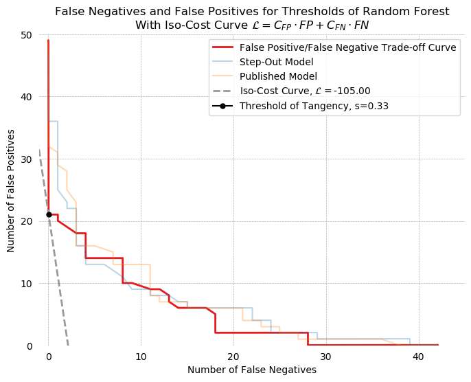
In-sample confusion matrices for both the Random Forest and the step-out model are presented next. Both classifiers have been set to their respective iso-cost minimizing threshold. The random forest performs better in every category, achieving higher precision and higher recall, plus better overall accuracy.
tree_in_predictions = [1 if x > 0.33 else 0 for x in rf.predict_proba(X_train)[:, 1]]
logit_in_predictions = [1 if x > 0.22 else 0 for x in results[5].predict(X_train[step_out_vars])]


jesse_tools.confusion_matrix_two(title='In-Sample Confusion Matrices, Random Forest and Step-In, Iso-Cost Minimized',
                                scores_1 = jesse_tools.score_classifier(y_train, tree_in_predictions),
                                scores_2 = jesse_tools.score_classifier(y_train, logit_in_predictions),
                                subtitle1=f'Random Forest, s = 0.33',
                                subtitle2=f'Step-Out Model, s = 0.22')
Finally, out-of-sample confusion matrices are presented for the two selected models. Again, the random forest achieves higher accuracy and precision at no cost to recall. In this case, however, the two models actually have the same false-negative rate, although the predictions of the random forest are slightly more trustworthy to an analyst overall (78% accuracy in negative classification vs. 72%).
tree_out_predictions = [1 if x > 0.33 else 0 for x in rf.predict_proba(X_test)[:, 1]]
logit_out_predictions = [1 if x > 0.22 else 0 for x in results[5].predict(X_test[step_out_vars])]

jesse_tools.confusion_matrix_two(title='Out-of-Sample Confusion Matrices, Random Forest and Step-In, Iso-Cost Minimized',
                                scores_1 = jesse_tools.score_classifier(y_test, tree_out_predictions),
                                scores_2 = jesse_tools.score_classifier(y_test, logit_out_predictions),
                                subtitle1=f'Random Forest, s = 0.33',
                                subtitle2=f'Step-Out Model, s = 0.22')
Finally, ROC scores are plotted for 3 models: my two "selected" models, plus the benchmark published model. Note that the out-of-sample ROC of the published model has gone up due to the interpolation of the missing variables. As a result, the random forest now performs no better out-of-sample than this model. Nevertheless, the loss-function is better minimized with the random forest, making this a good example of how to compare two models with equivalent AUC scores.
fig, ax = plt.subplots(1, 2, figsize=(20,8), dpi=100)
reg_names = ['Step Out', 'Published', 'Random Forest']
regs = [step_out_vars, published, X_train.columns]
for X_frame, y_frame, axis in zip([X_train, X_test], [y_train, y_test], fig.axes):
    for model, X_vars, name in zip([results[5], results[6], rf], regs, reg_names):
        tpr = []
        fpr = []
        for threshold in np.linspace(0,1,200):
            if isinstance(model, RandomForestClassifier):
                y_hat = [1 if x > threshold else 0 for x in model.predict_proba(X_frame[X_vars])[:, 1]]
                score = roc_auc_score(y_frame, model.predict_proba(X_frame[X_vars])[:, 1])

            else:
                y_hat = [1 if x > threshold else 0 for x in model.predict(X_frame[X_vars])]
                score = roc_auc_score(y_frame, model.predict(X_frame[X_vars]))

            TP, FP, FN, TN = jesse_tools.score_classifier(y_frame, y_hat)
            tpr.append(TP/(TP + FN))
            fpr.append(FP/(FP + TN))
        label = f'{name} AUC:'
        label += ' '*(17 - len(label))
        label += f'{score:0.3f}'
        axis.plot(fpr, tpr, label=label)
        axis.grid(ls='--', lw=0.5)
    legend = axis.legend(loc='lower right', fontsize=12)
    plt.gcf().canvas.draw()
    shift = max([t.get_window_extent().width for t in legend.get_texts()])
    for t in legend.get_texts():
        t.set_ha('right') # ha is alias for horizontalalignment
        t.set_position((shift,0))
    jesse_tools.remove_chart_ink(axis)
    if X_frame is X_train: name = 'In-Sample'
    else: name = 'Out-of-Sample'
    axis.set_title(name)
    axis.set_xlabel('False Negative Rate (Fall-out)')
    axis.set_ylabel('True Positive Rate (Recall)')

fig.suptitle('AUC Scores for Logit Models', fontsize=18)
plt.show()
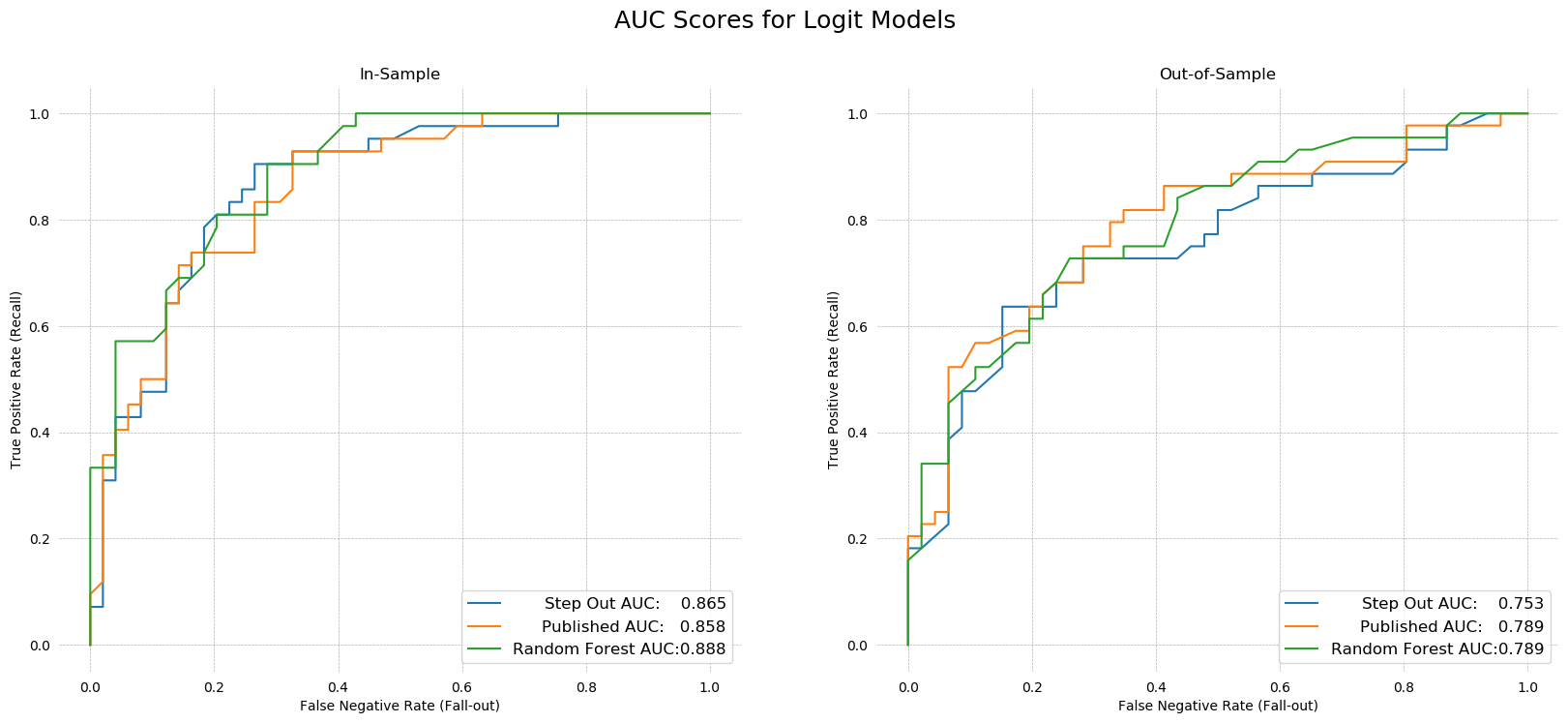
Concluding Remarks
A large number of models and tests have been presented in this assignment, and the final model performed only slightly better than the simple linear benchmark model that was originally published. The main reason for this is probably use to lack of data. Machine Learning algorithms are powerful not because their statistical power is greater, but because they scale with data. With only 180 observations, it is difficult to imagine we were destined to find complex non-linear interactions between the variables. Any nonlinearities found were second order at best, and as a result made additional gains from model complexity very small.
A wide variety of automated variable selection schemes were implemented, from PCA factor loading, to decision trees, to ensemble voting between a large number of models. I did not do anything with the ensemble vote -- perhaps a simple linear model using these combination of variables perform well. The real take-away is that this type of selection process leaves much to be desired, and it does not seem to me that data analysts and econometricians will be replaced with algorithms any time soon. The professional insight of the economists who wrote this benchmark paper was not beat any any of the automatic schemes.
A number of outliers were detected, but in the end not removed. I did experiment with removing them from the final random forest model that was scored, but it did not make any significant difference. This is likely because of the bootstrapping and sampling methodology that random forests use. Recall that a grid search of hyper-parameters suggested using only 10% of the sample to assemble each forest. This means each decision tree was built from only 9 observations, and those were selected at random with replacement, meaning the influence of outliers was already greatly reduced. Shallow learning with bootstrapping is a viable strategy for any number of classifiers, and may have provided better results if performed on a more parsimonious linear model. Algorithms like XGboost exist to extend the idea of gradient boosting to any model we like, but that's another test for another day.
Finally, the 50/50 train/test split made fitting the model quite difficult. I experimented with an 80/20 split, and models are immediately better able to make out-of-sample classifications. This is obvious, as there is more data. In the end, I kept the 50/50 split all the way though the assignment to allow for greater comparability between the models in in the first 21 questions and the models in question 22.
The biggest disappointment was the neural network model. These seem very difficult to train, owning to the near-infinite number of knobs and parameters available to twist and tune. The high AUC score I achieved using this model seems like a cheat, because I purposefully optimized it by looking at out-of-sample AUC scores. To truly tune such a model, much more data is required, allowing meaningful cross-validation. Here, with only 90 samples in the training set, a 3-fold validation means training on only 30 observations with 15 independent variables. The model is nearly saturated from the start.
All in all, though, fun project, I learned a lot.